To begin illustration week, we were told to research a fashion illustrator who’s designs inspire and influence us, my designer of choice who’s work really stood out to me was Zandra Rhodes. Her style as a designer uses lots of bright colours and interesting styles designs and patterns on her garments, which i have taken on researched in my design board. To expand my knowledge on her style of illustration i visited her ’50 years of fabulous’ exhibition at the fashion and textiles museum.
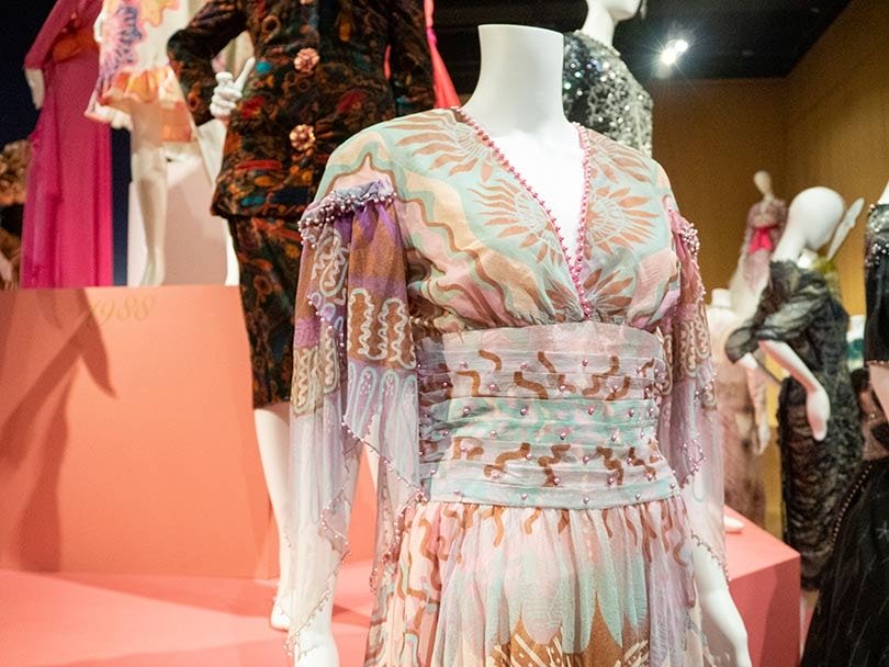
Her first prints were Pop Art-infused commentaries on the world of Sixties Britain; the designer felt that there was inherent structure within the pattern that could work with and enhance the shape and construction of a dress. With this concept as a starting point and with her distinctive approach to cut and form she produced her first solo collection in 1969.
Workshops
This past week I have been experimenting in drawing workshops, the first workshop consisted of drawing a body figure in front of us for 3 minutes, with each drawing having something missing, e.g. a head. We then placed one of our collected photos (of faces, arms and legs) into this missing gap, from this I learnt composure of the body and trying to focus on one aspect of the body in front of me, as well as not creating ‘perfect’ illustrations as sometimes they can be the most effective. I find these short tasks quite stressful as my personal style of fashion illustrations tend to be as neat and precise as possible.
Another workshop I took part in was mark making, this is an element of drawing I always try to incorporate into my designs, as its an effective style of pattern creating. In this workshop I was experimenting with lots of different types of marks, personally I find that just choosing one element of mark making such as cross hatching can be most effective by being used with different thickness of pens and colour, as well on various surfaces.
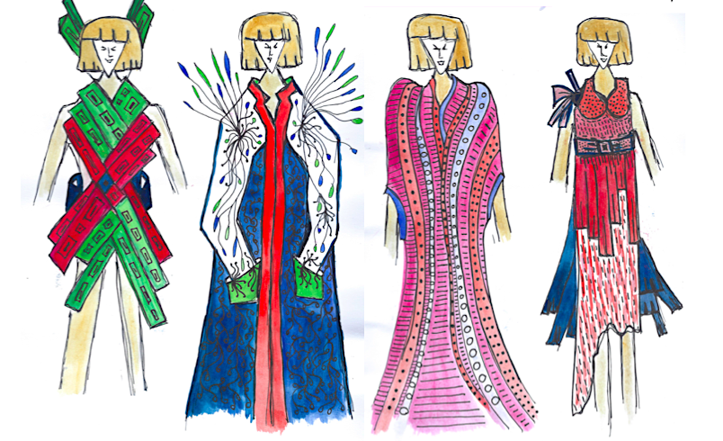
When it came to designing my final illustrations, I kept in mind what I had learnt in the workshops about being less precise and clean lined in my fashion illustrations. I think the designs above represent a line between precise and imperfect illustrations for me, as I hand drew the illustration models, where as usually I would trace off a template. I also tried to use more rough tones when adding colour and mark making. The colour tones I applied using watercolours and fine line pens, watercolour paint gives a nice effect when blending contrasting colours, and the fine liners are necessary when incorporating elements of mark making and patterns over the top of the paint.
When I continue creating fashion illustrations in my next upcoming projects, I am excited to use the skills I have learnt this week and incorporate them into my future work when designing for garments.

