Prevent is a Government strategy that was set up as part of a wider counter-terrorism strategy called Contest. This strategy is split into four work streams that are known within the counter-terrorism community as the “four P’s”: Prevent, Pursue, Protect, and Prepare. The purpose of Prevent is to stop people from becoming drawn into or supporting terrorism. Due to the current severe threat from terrorism and extremism in the UK, the Prevent strategy aims to prevent people from supporting terrorism or becoming terrorists themselves.
My brief for this project was to create a visual response to Prevent in schools and HE. Before starting this project I had no knowledge on the Prevent strategy, and found it really difficult to think of ideas on where I could take this project from a design point of view.
Stereotypes is a word that comes to my head when I think of global terroism. An article I read relating to the New Zealand mosque shooting in 2019 has a large title in bold saying ‘Around the world, the majority of victims of terrorist attacks are Muslim.’ Although this is not something I can comment on, it must be incredibly terrifying and difficult for muslim children growing up having to hear comments like this thrown at their religion and ethics. Feelings like this cause vulnerable people to rebel and defend themselves in many ways which can attract terrorism. This gave me the idea to design a poster which captures children and adults attention with colour and style, which will also contain one or two positive quotes and a large title with the intention of spreading uplifting and positive vibes.

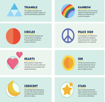
When it came to creating samples for my poster, I wanted to design using symbols and colour that represent emotion and feeling. After doing some research online I gained some initial ideas which I merged together and designed repeat patterns out of in photoshop.
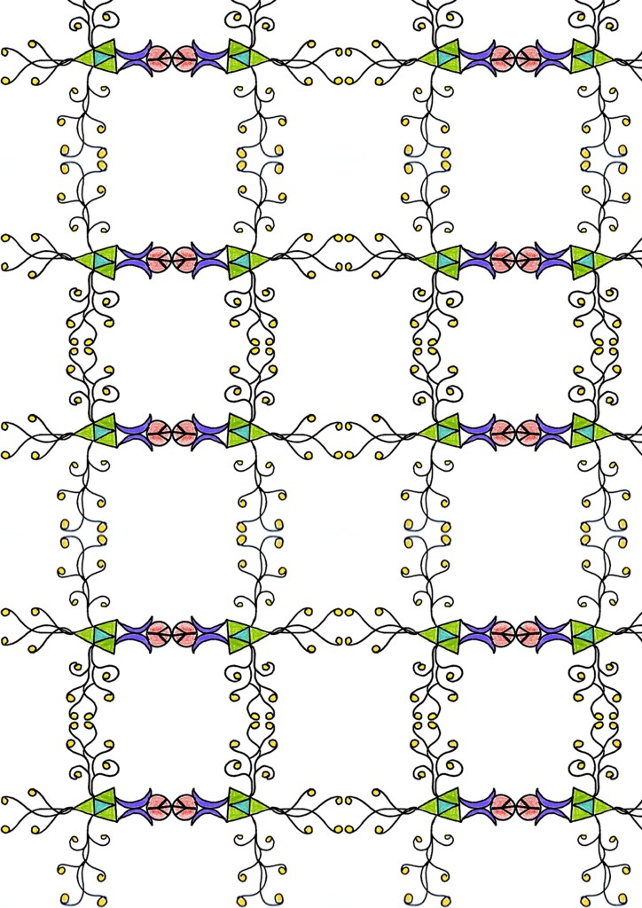
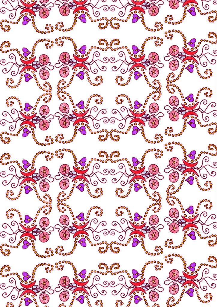
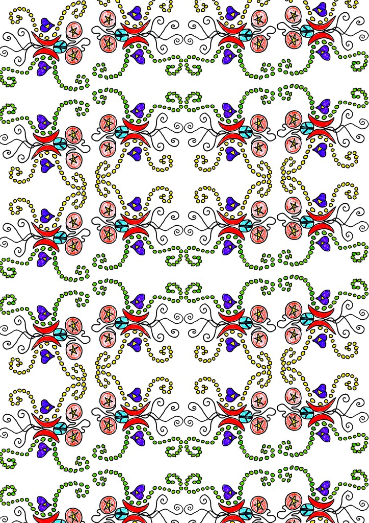
I am really happy with how the samples above came out, I used photoshop to also adjust the colour tones and contrast. As well as using them in my poster i believe they could be used in designs for wallpaper and fabric prints to attract a larger audience.
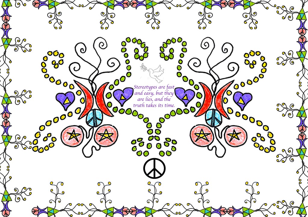
My final poster came out as I expected it to, once I had finished creating it I realised that it probably captures the female attention more than male, but putting that aspect aside I like how all the colours and patterns all come with a deep meaning to them which people can remind themselves of when they see it.