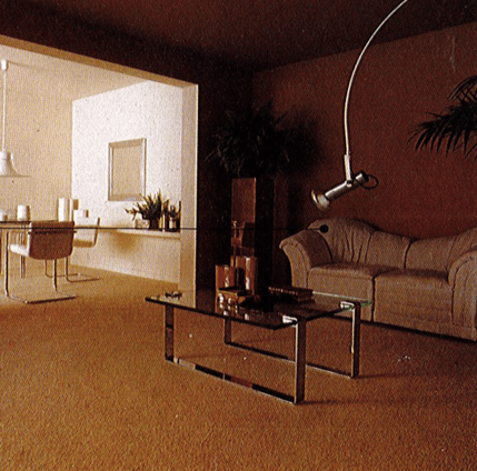
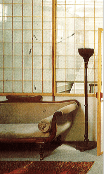
When exploring the era’s of design, something that really stood out to me was the deference in colour tones and how colours have been ascribed social meanings for thousands of years. We tend to think of the meanings of colour in fixed terms: red for anger, yellow for cowardice, pink for girls and so on. But when we look at different colours from a historical perspective, it turns out that their meanings are often changing depending on place and time.
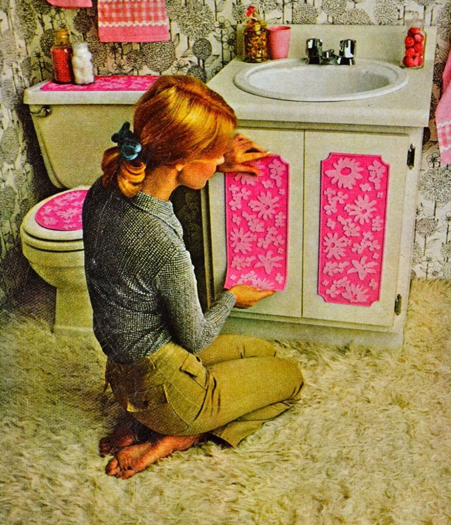
Car manufacturer Dodge launched its 1955 pink and white ‘La Femme’ model (complete with lipstick holder and complementary pink umbrella) with the slogan ‘never a car more distinctly feminine’, while Elizabeth Arden used ‘Pink is for Girls’ to market their cosmetics. Over the years pink has changed from being primarily associated with women to becoming a gender neutral colour, of course not all men would choose to decorate their homes, or style themselves in this colour, but having the option to in this current decade is very important.
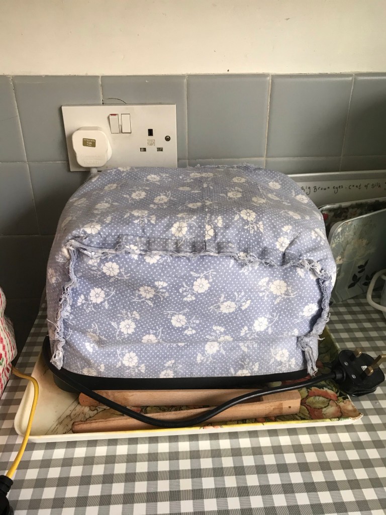
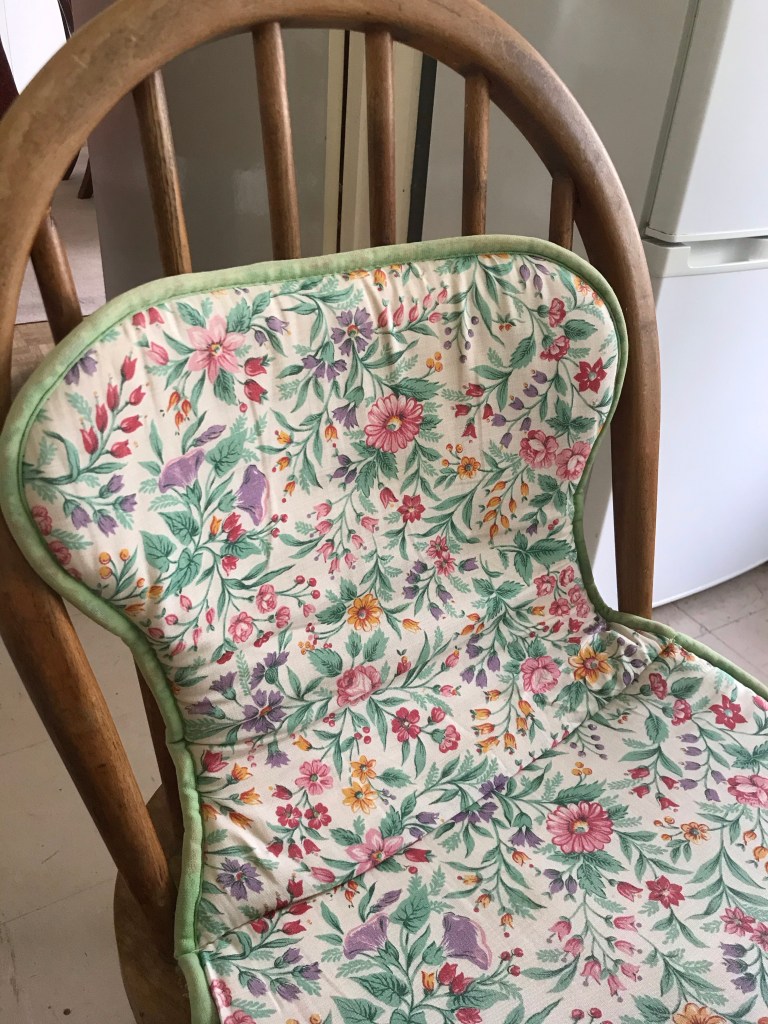
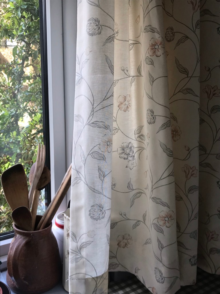
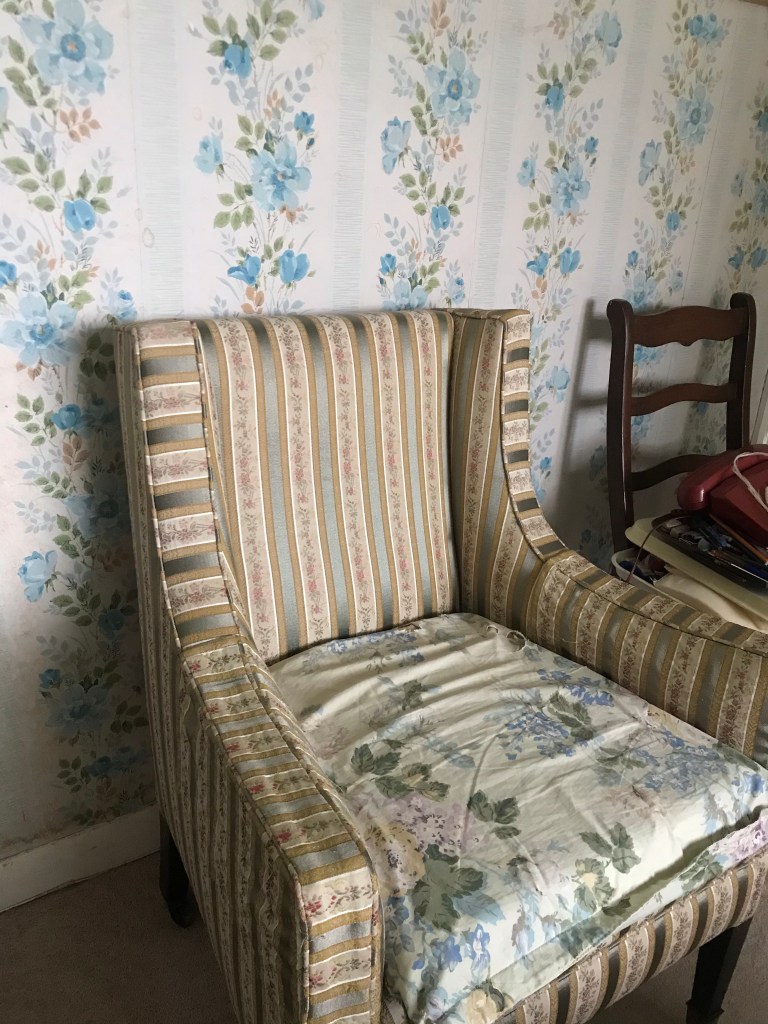
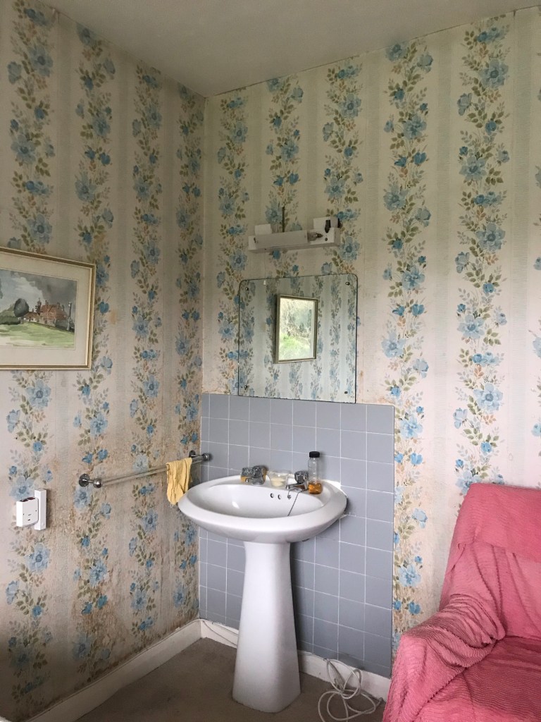
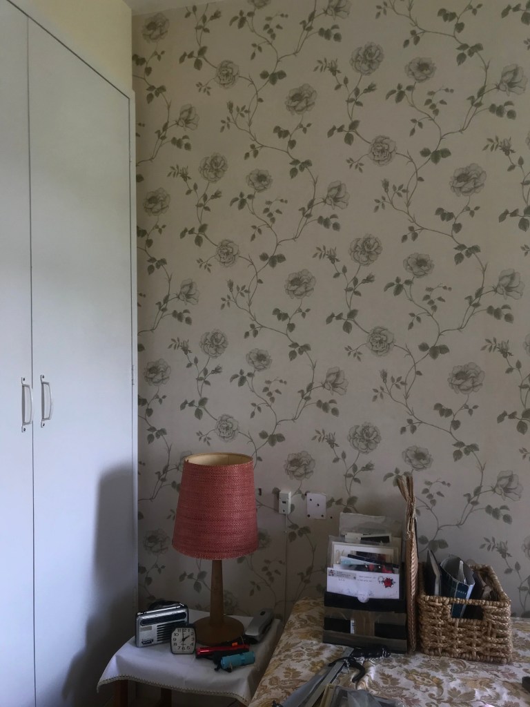
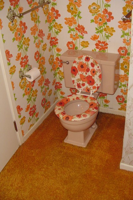
When visiting my Grandma’s house at the weekend, I found this to be the perfect opportunity to gather photos of wallpaper and textiles around her house, as the interiors of her home is very retro and contains lots of amazing textile items.
One thing that stood out to me is the amount of floral fabrics which had been used in her kitchen. Floral curtains were used to decorate her windows, toaster and teapot covers, clashing rugs on the floor, and green and pink decorative chair cushions. Although this mix of fabrics seem unappealing and crowded, I believe it very much suits her 70s home decor style, giving a warm and cozy feel.
In terms of her wallpaper in a guest bedroom, the floral patterns used were generally very simple, but as they had been repeated in strips on top of each other, it made the rooms feel crowded and messy. I believe this effect can look good when only one wall in a room is layered in wallpaper, but all four walls I think is too much. The second bedroom however, consisted of only one wall holding wallpaper, keeping to the floral theme but less vertical and reflected. Therefore I really liked how the designs flow in a neater and calm way next to each other.
To begin gathering research and information for my project I turned to exploring trends of wallpaper styles from the 50s/60s/70s/80s/90s as well as current designs. Using Pinterest I came across a number of designers who I felt inspired by and who’s work visually expressed the style trends of their era. To begin my sketchbook I created a concept board including aspects of design from each of the six artists I have explored.
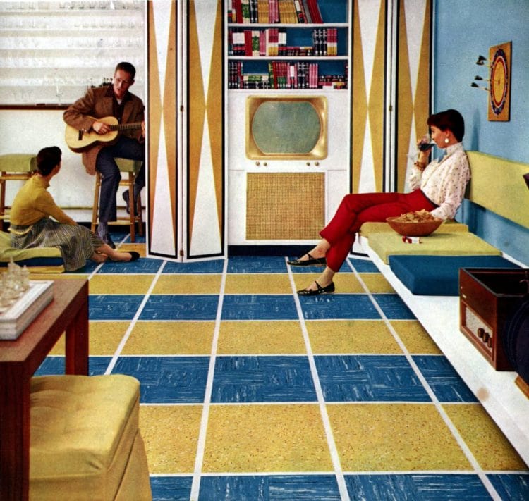
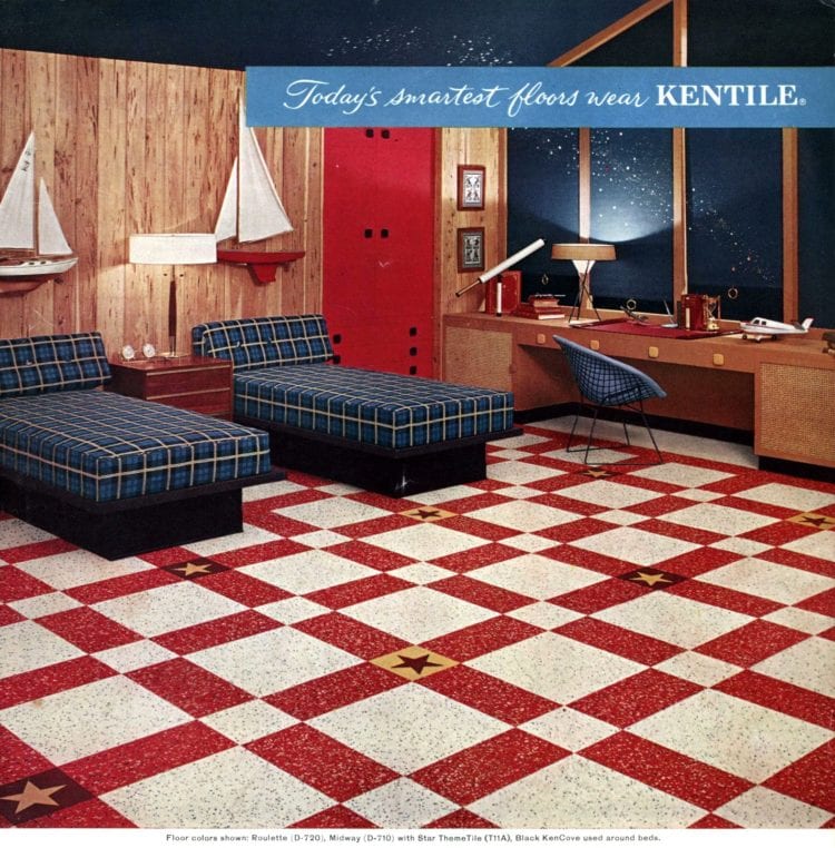
Psychedelic Art is the first trend I have explored. Most commonly used and introduced into wallpaper designs during the 1950s, this was a popular time when home decor was becoming bolder, brighter and overall adding more colours to homes. Not only were patterns commonly seen on wallpaper designs, furniture and clothing, they were also being introduced to flooring.
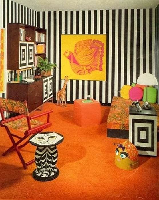
The styles of patterns used were all bright with abstract designs, often with science-inspired imagery such as calyxes, starbursts, atoms etc. Pretty sprigged florals set against polka dots or stripes in sugary pinks, reds, blues and yellows were often seen in other rooms of the house or even in the same room, as clashing was very much embraced.
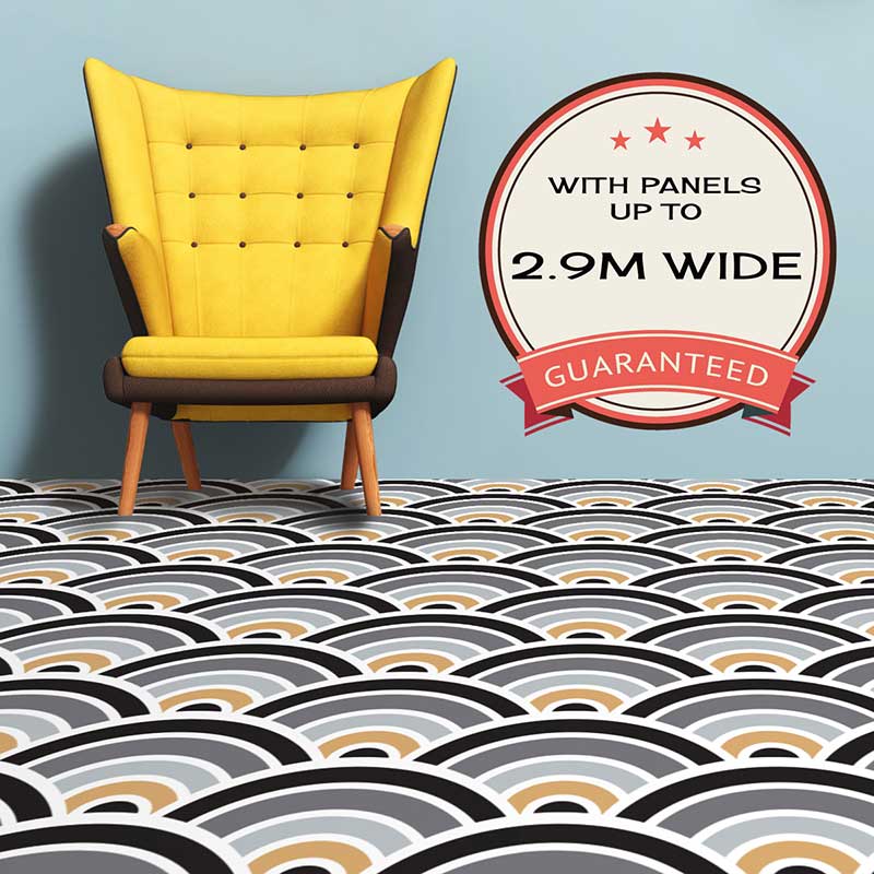
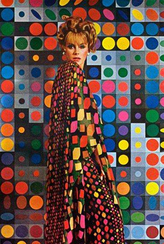
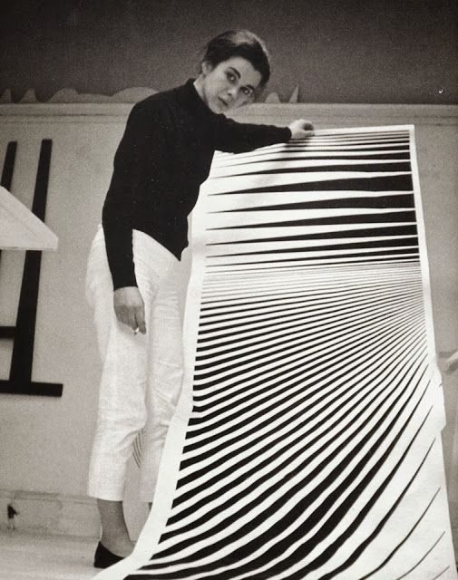
Op Art was a major development of painting in the 1960s that used geometric forms to create optical effects. Bridget Riley’s work very much influenced designers to incorporate aspects of the art movement into their work, some stuck to the original style of strictly black and white tones, but as home decor in the 60s was still very bright and colourful, many designers took inspiration from the simplicity of the geometric shapes and incorporated lots of different colours in them as seen in the first photo below.
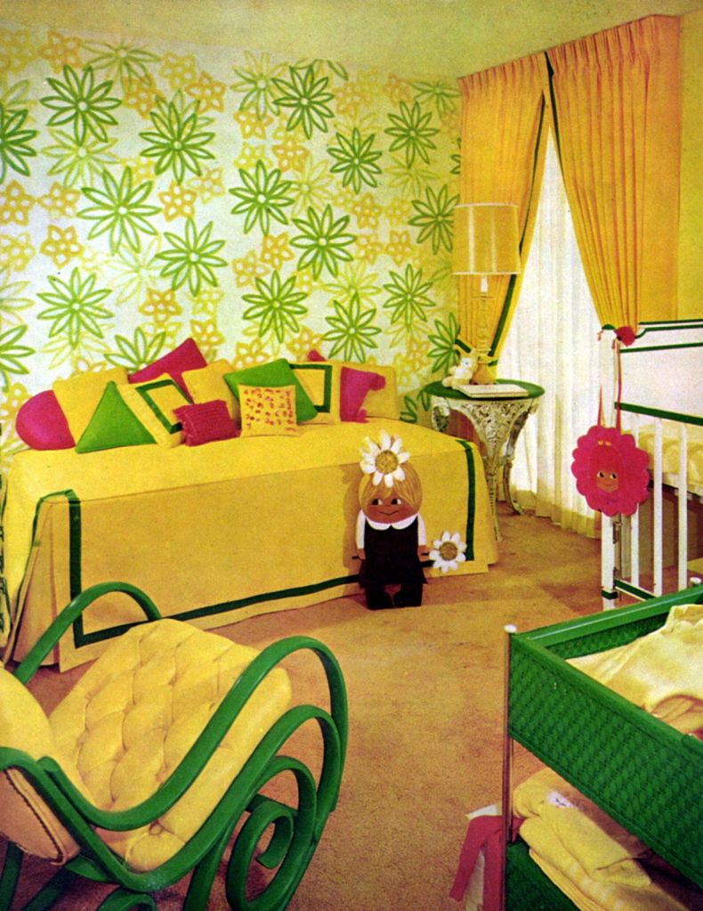
Floral, Flower power was a slogan used during the late 1960s and early 1970s as a symbol of passive resistance and non-violence ideology. Hippies embraced the symbolism by dressing in clothing with embroidered flowers and vibrant colours, wearing flowers in their hair, and distributing flowers to the public, becoming known as flower children. This movement not only affected the fashion of the 70s, but also hugely influenced home decor and wallpaper designs, to express the symbolism towards flower power.
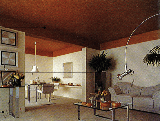
Minimalism, A trend which I am very keen on, as in interior design I find lots of patterns on walls and furniture doesn’t allow me to feel relaxed or calm. Minimalist architecture became popular in the late 1980s in London and New York, where architects and fashion designers worked together in the boutiques to achieve simplicity, using white elements, cold lighting, large space with minimum objects and furniture. From this people started to declutter their homes and use a simple colour palette when decorating. Wallpapers were either kept to very minimal designs, or not used at all in replacement to simple paint.
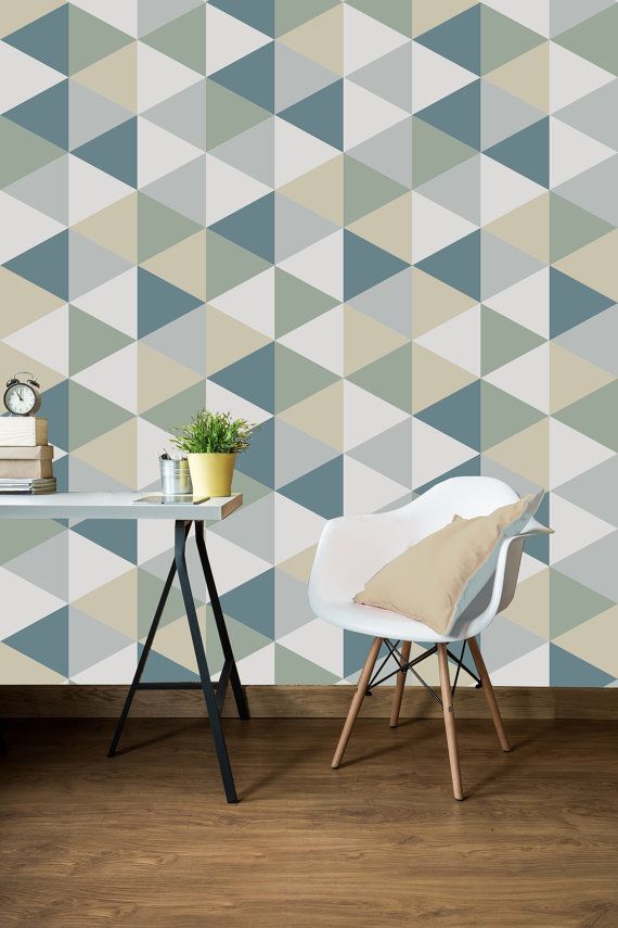
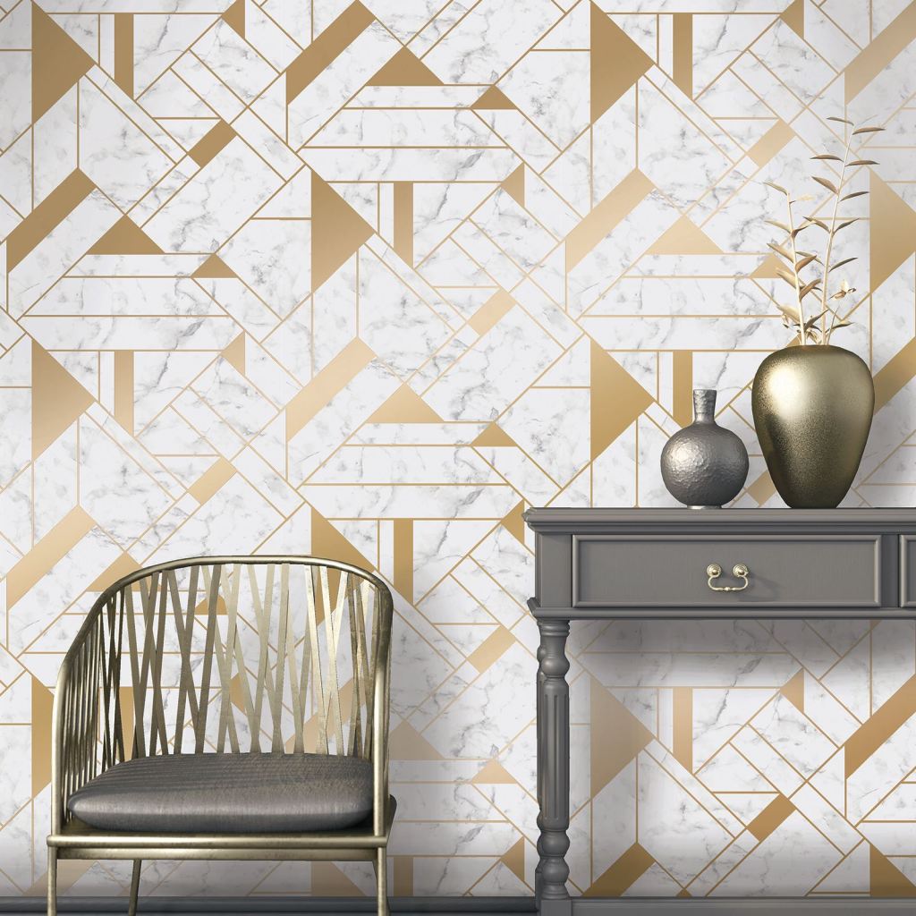
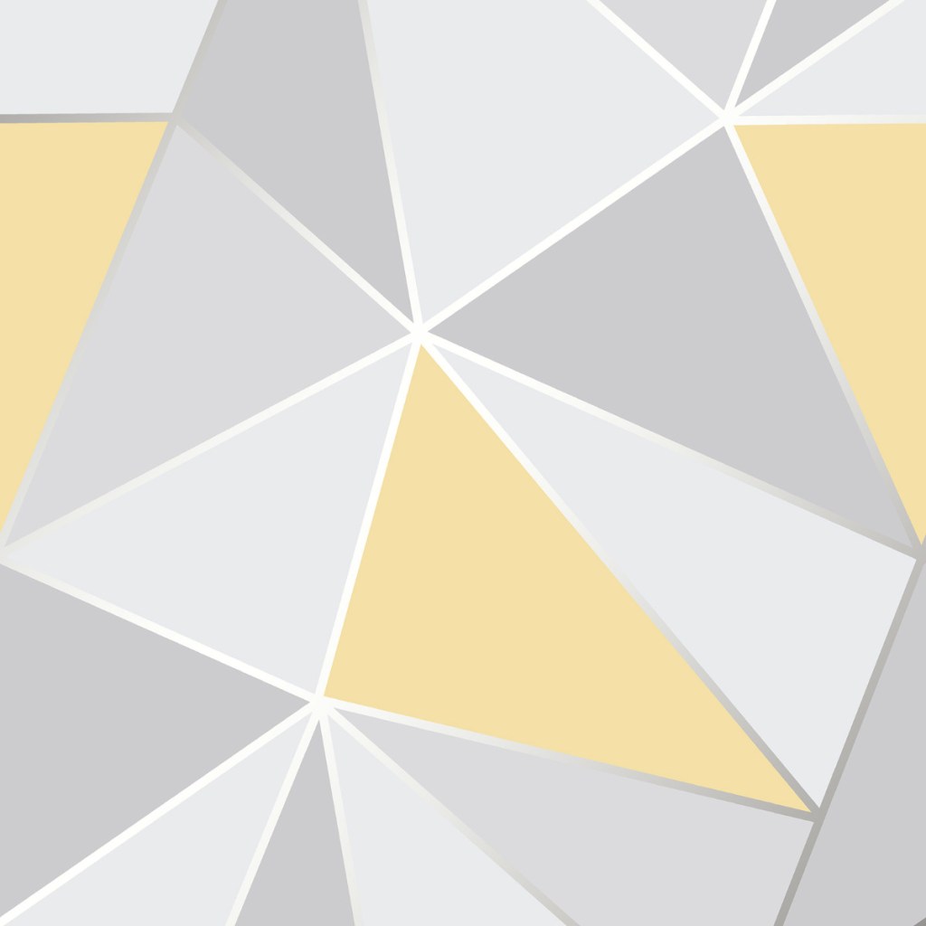
Contemporary Wallpaper, In terms of gathering information for current wallpaper trends, I bought a few interior design magazines to give me inspiration for choosing two styles to collect research on. The first style I chose to explore was Geometric, as this can be used in a minimalist style, and enhanced with colour and multiple repeats to add character to a room. A popular style seen not only on wallpaper, but also textiles for interiors.
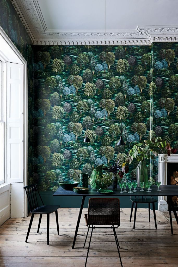
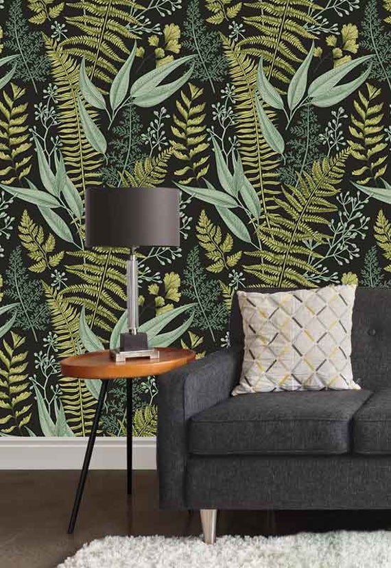
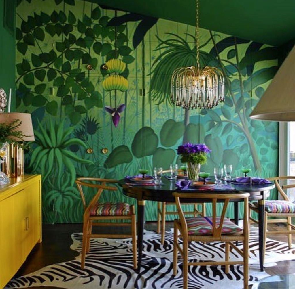
The second style I have chosen to explore is Botanical Wallpaper, very similar to floral it incorporates shapes and colour found in the outdoors. I find this style of wallpaper makes rooms look elegant and fresh, and is definitely my favourite style of wallpaper designs I have researched so far. To create some signature designs in response, I have used a flower press to shrink and flatten some interesting plants I found in my garden. With some of the leftover plants not used, I have let them set in hot water and vinegar for an hour to create some natural dyes, which can be used to paint or dye fabrics/ paper with, a cheap and simple way of being sustainable.
When developing ideas towards my FMP project, I decided on a topic which I am very passionate about and have quite a lot of self developed knowledge on. The aim of this project was to progress around the theme of Health, Fitness and Wellbeing. I believed that choosing a topic which I have key interest to develop my understanding on would allow my project to continuously be exciting and rewarding.
Writing my proposal and reading the feedback from it is where I became aware of important key factors which I did not intend to expand upon. A comment that stood out to me from my tutor is that my proposal sounded like I would be developing a campaign rather than creating a project from a designers point of view. This immediately made me re-think my proposal, as being a design student I have always focused on developing and creating designs from my ideas.
When re-writing my proposal my aim was to think about how I could turn my original concept into some sort of garment or textiles. As my project proposal resolves around the health and fitness industry, I thought about designing a sportswear rage, making sure to include elements colour and pattern in my designs, I would create signature repeated patterns to be printed on these sportswear garments. Although I believed this concept could be very successful for my FMP project, the idea of designing and creating sportswear garments did not make me feel particularly confident, as when I explored the project ‘Progressive Detail’ in developmental stage, I found that designing for sportswear was quite difficult as it requires lots of research on the quality of the fabrics and making sure they are durable, and the best possible quality for all weather sports whilst being sustainable.
So from this I decided to completely move away from my original concept, but rather focus on designing patterns as I believe this is my strongest aspect in the fashion and textiles industry.
Autonomous Substrates was the last project to be explored in developmental stage, so unfortunately I begun and completed this project the week after writing my proposal. Personally I believe this was my best and most successful project, as it resolved around designing repeated patterns to create the outcome of wallpaper designs. This gave me the inspiration to incorporate this topic into my FMP, as I feel very confident in my ability to deliver a strong 8 week project and outcome.
My new concept I have decided on, is to explore the industry of wallpaper prints, designs and trends from early 1950s up to present day. I will be researching trends from Psychedelic, Op Art, Floral, Minimalist and Contemporary inspired designs, to gain knowledge and inspiration for when I come to designing my own. To help reference my work I will be keeping a bibliography, where I can keep track of all the websites, galleries, shops and artists I explored, also to visually track how my research is being constantly developed over the 8 week period. When exploring each decade of design I intend to thoroughly research the colour palettes used as well as prints used on textiles items displayed in homes. In terms of my response to each decade of design, I would like to take inspiration from my secondary research, and primary evidence to design my own interpretation of wallpaper designs to suit each decade trend.
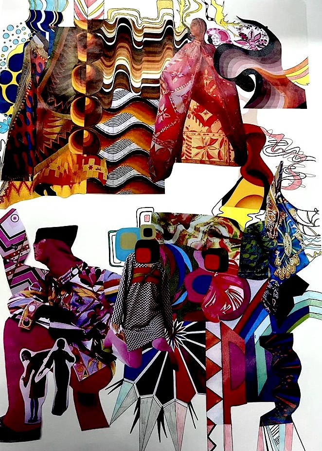
To begin BA week, I was told to create a concept board which resolved around an era and designer of my choice, I decided to look at designs from the 70’s which lead me onto discovering the textile designer Barbara Brown.
Lots of her designs can be seen in my concept board, I find her work really inspiring and love her colour palette styles. An element of her designs I decided to explore further into is how she incorporates regular shapes such as triangles, squares and circles into her work and then develops them into her personal style.
The aim of this project was to use elements of design from my concept board to create a shape on the stand, which can later help with finding a shape for a piece of clothing, specifically 3D. I was quite disappointed when reading the brief for this project, as from spending the past diagnostic stage using waste paper and recycled materials to create garment designs and illustrations from stand work, I would have hoped when working in a degree style project we would have been given the option to bring in fabrics to design or drape with, personally I would have found by doing that this project would have been more enjoyable and memorable as i find working with paper and waste materials very frustrating.
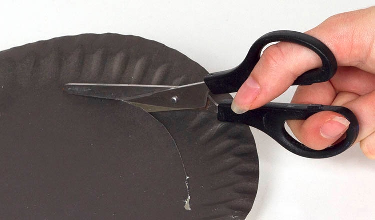
From looking at Barbara Brown’s work I decided to use the shape of a circle to develop on my stand work. The materials I brought in to create this with were old paper plates, string and paper straws. Unfortunately I lost the photos I took when developing designs on the stand but to create my 3D outcome, I cut into the paper plates so I had just the round outer perimeter to work with, to attach either end of the plates I hole punched them together and then used string to pull the ends together, creating a round 3D effect. After creating a number of these I successfully draped them round the mannequin, drawings small illustrations of my progress on paper whilst I experimented with the style of draping I desired.
The purpose of the paper straws was to add colour and interest to my 3D stand outcome, as it looked pretty plain and dull with just the plates around it. I used thick coloured pens to draw small and large designs on these paper straws which I found to look really effective. I then linked these together with string and intertwined them around the paper plates.
Overall I was really happy with my 3D outcome, although this project was not what I was expecting from a degree style workshop, it benefitted me to work with materials that I would never choose to design with, as well as being able to incorporate a well known textile designers work with my individual style of design.
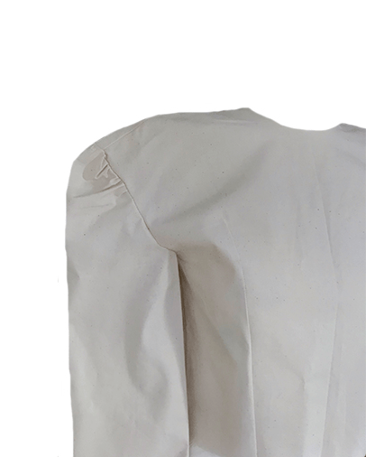
Attaching the sleeves was the third task in the pattern cutting workshop, I found this aspect very difficult as at this point I realised I hadn’t left a big enough seam allowance either side of my front and back panels. Despite my errors I decided to make the most of my creation so far and persevere with attaching the sleeves.
Set in Sleeves..
A sleeve: joined to the body of a garment by a seam starting at the edge of the shoulder and continuing around the armhole.
Using the ‘sewing minis’ sleeve tutorial on youtube I attempted to create my curved sleeve cap, making sure i kept one thread loose to then be gently pulled in order to created a curve. Once completed i moved onto hand sewing the underarm sleeve.
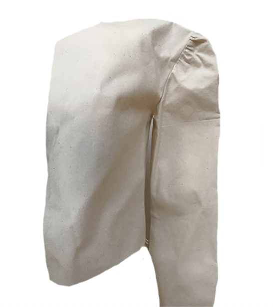
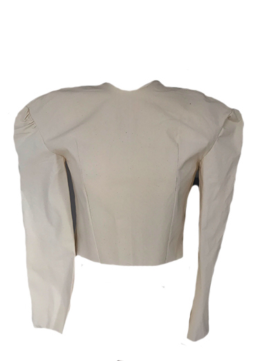
Moving onto attaching both sleeves to my toile, I realised I had made another mistake of accidentally sewing gathers into my cap, still attempting to make this toile come together, I started sewing the sleeve in. Beginning from the underarm and slowly stitching upwards my sleeves successfully attached to my toile.
Although my finished toile didn’t turn out how I planned it to, with the set in sleeves being too gathered I was still overall proud of my perseverance throughout this workshop, as well as being happy of my final piece. It may not look like the toile expected but I’m sure it can be used in a similar garment design. I think its important to embrace our errors and it teaches me to always double check I am on the right track in pinning and stitching when I create another toile in the future.
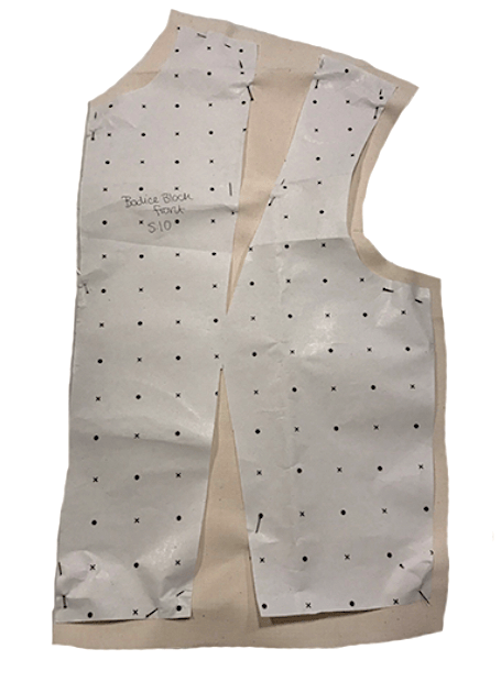
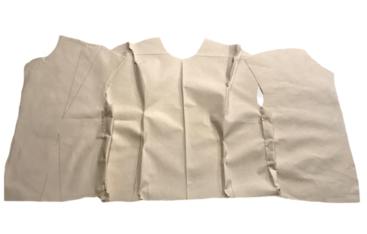
Once i had marked out my dart locations, and cut into the paper of the bodice block for the front and back toile, using the slash and spread method i was ready to pin it onto my calico to then be cut out.
Slash and Spread..
The slash method, both slash and spread and slash and close is a fundamental pattern making technique, in which a pattern piece is cut or slashed and then spread apart to add fullness or closed to reduce fullness. This technique is most often used to add fullness.
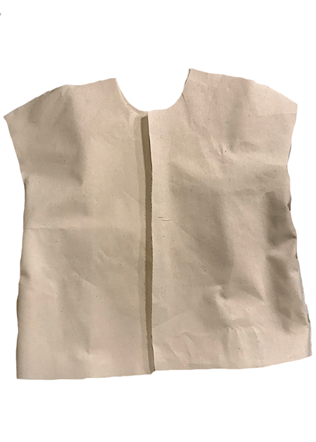
Once i had cut out both bodice blocks for the front and back of the toile, i attached them by sewing down the side seams with a sewing machine. It was important to leave an identical seam allowance so that when attaching the front and back bodice together, they would have an identical width gap for when attaching the sleeves.
Once the sides were attached i then used pins to mark out the top of my darts, which i then sewed down.
What are darts and what do they do? Darts are folds and sewn into fabric to take in ease and provide shape to a garment, especially for a woman’s bust. They are used frequently in all sorts of clothing to tailor the garment to the wearer’s shape, or to make an innovative shape in the garment.
What type of dart was used used on your original bodice block you copied at college? The darts i used when copying off my bodice block were Bust darts and Plain darts.
There are lots of different types of darts, with many different purposes…
Plain Darts: Plain darts are usually the first type of darts that people learn to sew because they are the most common. Plain darts are used to make pleats and seams that are found in the bust and hip parts of clothing patterns.
Bust Darts: Bust darts are used to ensure that tops and bodice parts of clothing are fitted for a women’s figure.
French Darts: These darts are also used to ensure that tops are formfitting on women. They start at the bottom (waist) area of a top and travel upwards towards the bust area.
Waist Darts: Waist darts are simple darts that are found in ungathered skirts and trousers.
Elbow Darts: If fitted sleeves are needed in tailored jackets, then elbow darts are used.
Double pointed Darts: Two darts are joined together to give shape to the centre of a dress or jacket, for example.
Curved Darts: A dart is curved when it is stitched to be convex or concave (instead of straight) to give you the shape that you need.
Autonomous… Describes things that function separately or independently.
Substrate…An underlying substance or layer that can be added onto.
To begin this project my task was to pick a word from one noun, one process, one descriptive and an outcome, the words are chose were..
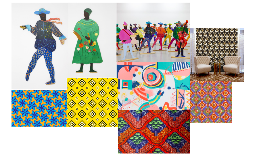
Lubaina Himid – A British artist who’s work revolves around black women, and uses many African inspired patterns and colour palettes in her work.
Mark – Mark making is a term used to describe the different lines, patterns, and textures we create in a piece of art.
Smooth – Having an even and regular surface; free from perceptible projections, lumps, or indentations.
Wallpaper – The outcome of my project I will be designing for.
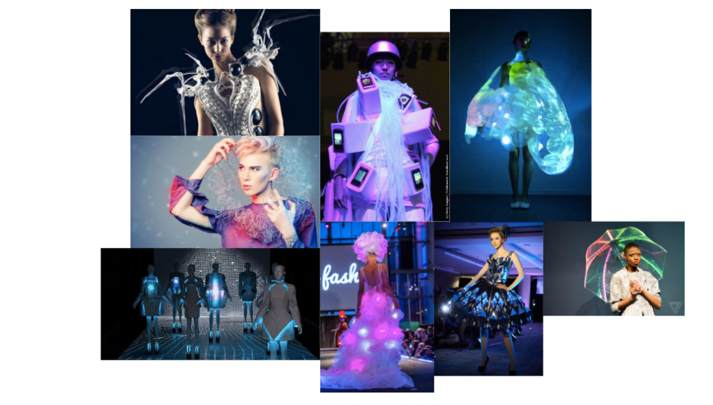
The proposal for my project is to design pattern repeats using elements of mark making, taking inspiration from historic African colour and designs palette. To fit the brief of looking at futuristic tech, I will be researching into futuristic wallpaper trends, and then merging the two designs together, historic and futuristic to create a collection of my own repeated wallpaper designs.
The first concept board I created revolves around the three words shown above, the colours are very bright and bold, and the patterns are in general pretty simple and are repeats of each other.
When creating my design board, I researched online historic African patterns, and found a few styles that caught my eye. This board really helped me pick out a few relevant shapes and styles that could then be transferred into my own designs. By taking some photos of blank wall space in my house it helped me to create a few mini sample illustrations, getting an idea of diameters and style.
My concept board for futuristic technology is exploring ‘wearable tech’, I have been looking at the ways in which the clothing stands out by using lights, without lights these clothes wouldn’t be interesting at all.
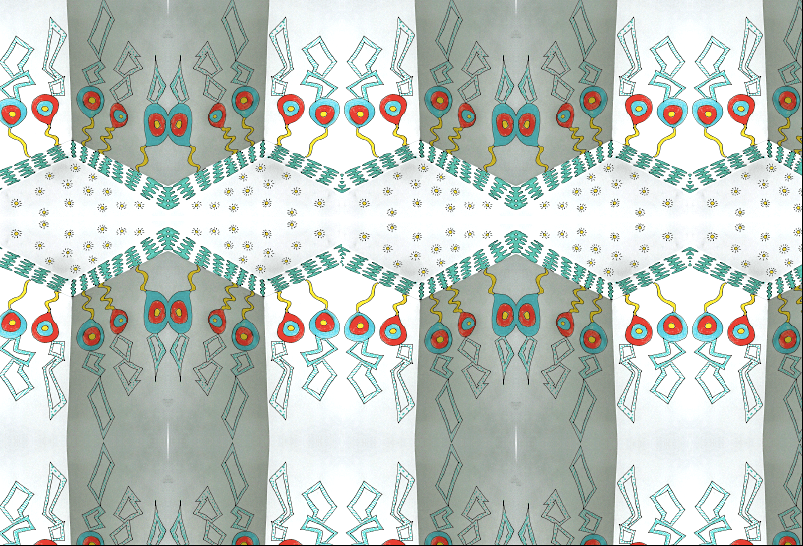
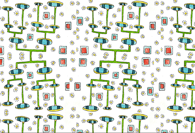
When it came to creating my samples I designed a number of samples developed from my ideas of historic African designs, and some other sample designs taking inspiration from futuristic lighting tech. From these samples i created my final designs by merging the two together styles together.
I am really happy with how these wallpaper designs came out, I used photoshop to create design repeats which made them suitable for wallpaper use. In terms of the purpose of my wallpaper, I created it with the idea of having ‘LED’ light strips installed behind my wallpaper, so that on every circle and square seen in my wallpaper, the lights would shine through.
This project stood out to being one of the most enjoyable for me, designing wallpapers is something I have always been passionate about and an element of design I would love to pursue in the future.
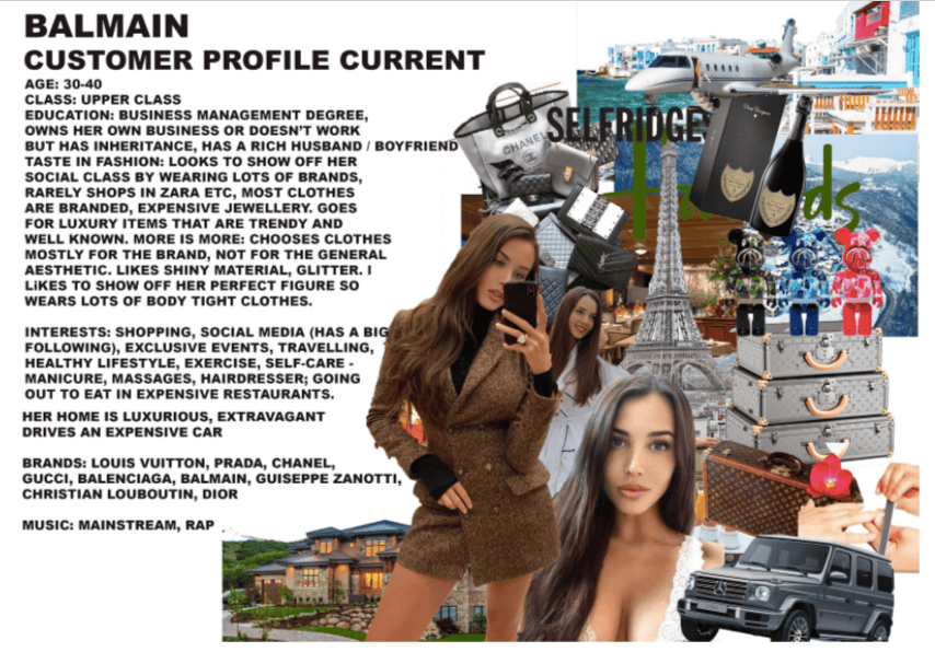
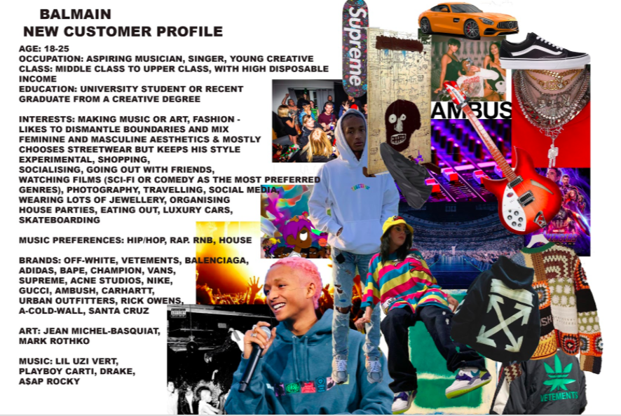
When creating our re-brand customer profile, it was important to research the current Balmain customer’s interests and age range to help us gain an idea of how to appeal to as many customers as possible.
Balmain’s current customer is in the age range of 30-40, an upper class business woman, who has interests in shopping at luxurious brands and treating herself on a regular basis to expensive clothes and food with her friends. Her music taste varies from mainstream chart music to rap.
When creating our new customer profile for our re-brand store, our aim was to appeal to a younger age range, who is a middle class graduate with a high disposable income. Of course we took into consideration that this customer wouldn’t have the money to casually spend on luxury goods but they often like to treat themselves once in a while.
Interests for our new customer ranges from making music and art, with a high interest in fashion. When styling themselves they like to dismantle boundaries between masculine and feminine as well as mixing their aesthetic. Their music taste mixes from Hip/Hop, rap, r&b and house.