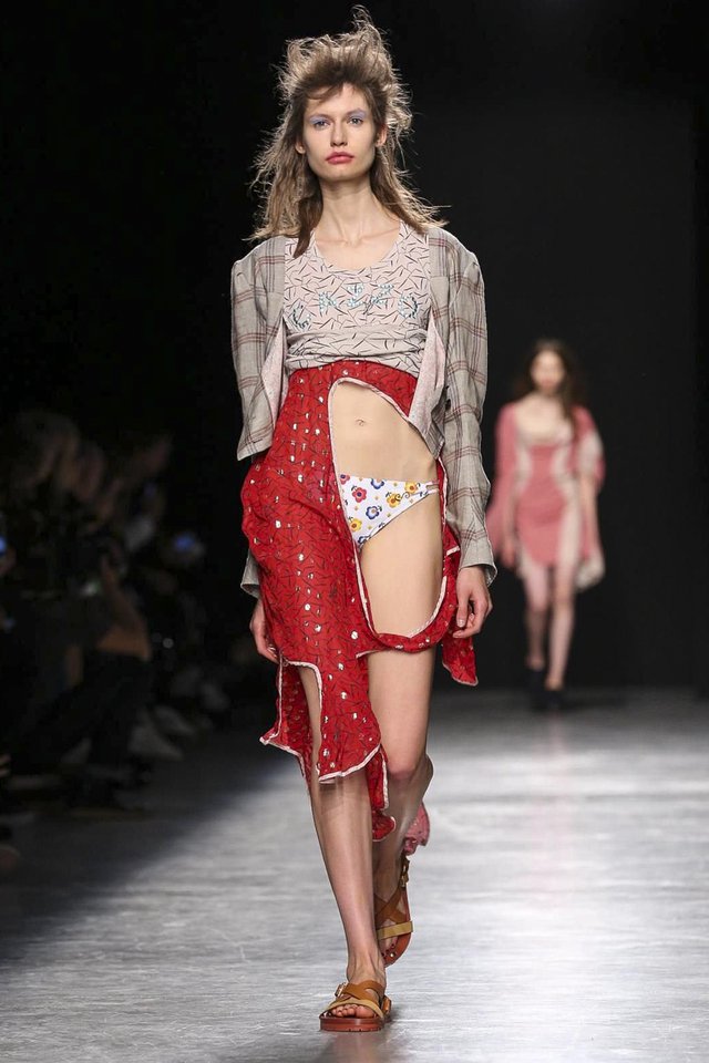
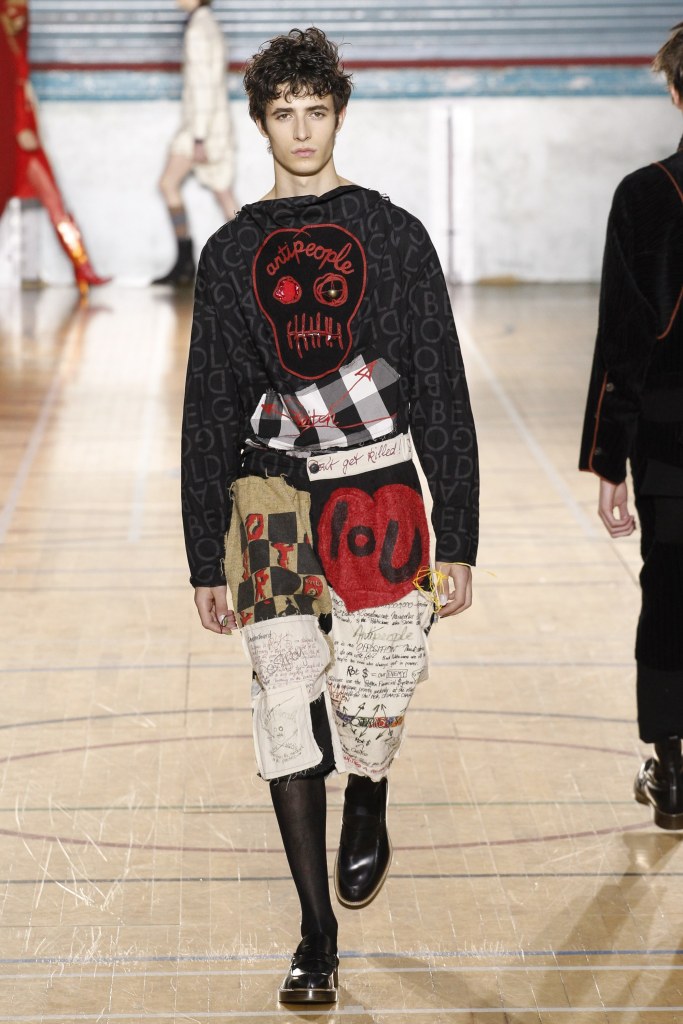
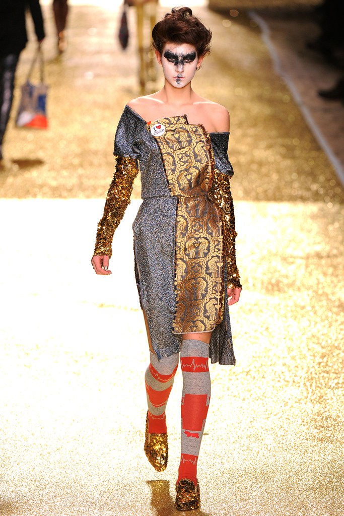
The punk look has come to be associated with clothing that has been destroyed, has been put back together, is inside out, is unfinished, or is deteriorating. Punk was an early manifestation of deconstructionist fashion, which is an important component of late twentieth-century postmodern style and continues to be seen in the work of contemporary fashion designers such as Vivienne Westwood and Martin Margiela.
Other elements that have recently been associated with the postmodern mode include clothing and imagery that appear dirty, ripped, scarred, shocking, spectacular, cruel, traumatised, sick, or alienating. All of these were qualities actively sought by Vivienne Westwood and the punks of the 1970s.
For Deconstruction/Reconstruction week, my brief was to gather together 8 old garments of mine, which I would take apart to then reconstruct into a new design. The clothes I brought in were…
A polyester swimsuit
Pink cotton shirt
Cotton blue and green tie
Cotton pink trousers
White cotton shirt
Mesh black top
Sequin grey top
Linen cream shorts
The first day of the project was begun by studying catwalk trends, where designers such a Vivienne Westwood had created a collection made out of taking apart unwanted clothes found in charity shops, which then would be reconstructed into her own garment designs to form a collection.
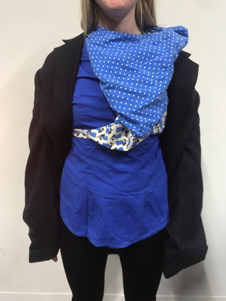
To begin my styling process i used mine and my partners old garments to create drapes out of. By experimenting with the clothes like this it made me think outside the box in terms of layering and using inside out clothing as seen in a few examples above. After completing a number of these drapes and drawing quick illustrations from them in my sketchbook I moved on to cutting up some of my clothes.
The idea behind this exercise was to use my imagination by combining many different textures of fabrics and colour combinations, to then layer onto each other to form a new reconstructed garment. This was quite hard for me as I struggle to think off the top of my head when it comes to instantly designing a new design in the space of a few minutes. After experimenting with draping, I moved onto developing templates out of each of my clothing items, where I was experimenting with creating pleats and structures out of the templates on paper. I found this a really easy and simple was to broaden my knowledge on shapes and pleating.
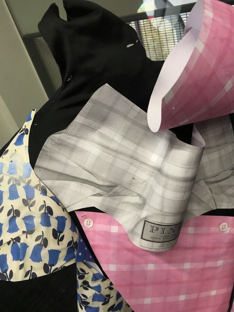
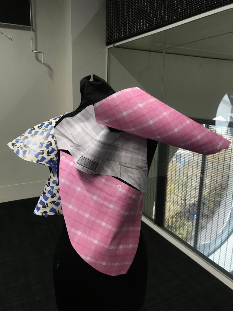
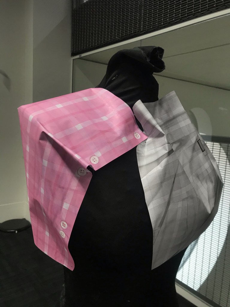
Using paper manipulation I folded and pinned these photocopies onto a mannequin, in the hope of finding new shapes through the process of folding and developing silhouettes created from the paper, which may have not been possible with fabric. This created bold, 3D lookalikes which helped me visualise the layout and placement of the different patterns and colours on my clothing, to then be merged together.
After experimenting with sampling, and draping my cut up garments, i created templates out of each of the clothing items, where as seen above i was experimenting with creating pleats and structure out of the templates on paper.
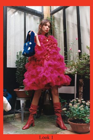
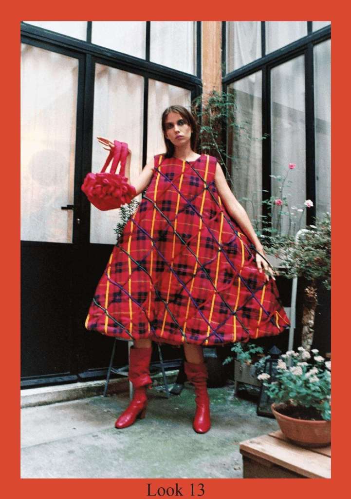
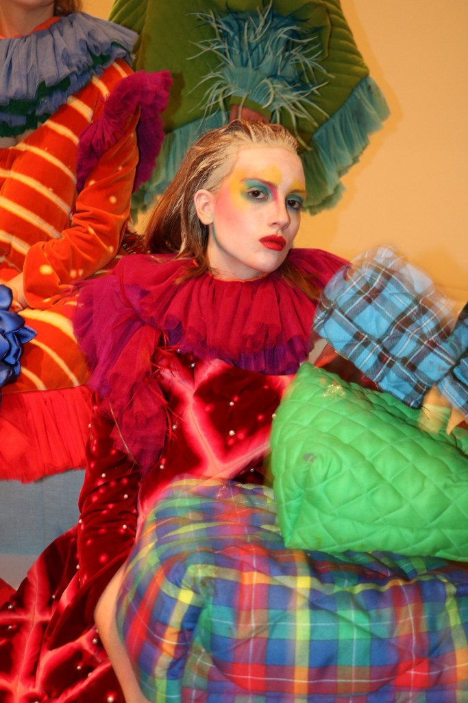
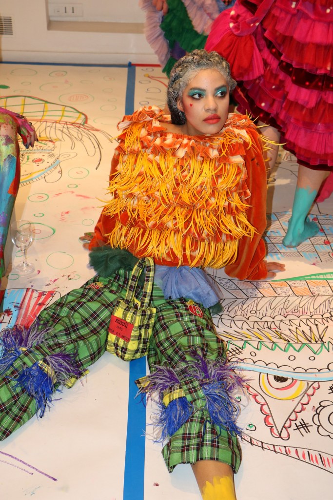
After completing a workshop in class revolving around exploring the process of quilting, knotting, fraying and patchwork. I gained quite a few ideas towards my final outcome. To further my inspiration towards these ideas, I started researching designers who focus on designing their clothes using some of these techniques. From my research I found the designer Atelier Mimii, who’s work is very unique and uses an array of contrasting colours when adding detail and patterns to her garments.
The message behind her brand is less linked to traditional notions of sustainability, and more to the style that compels her to save every bit of fabric for reuse. As such, most of her garments and accessories are one of a kind and produced in limited quantities. As for the garments, which consist of A-line dresses distressed; hand-dyed velvet dresses with Victorian sleeves and collars; quilted, pearl-covered corsets reminiscent of 16th-century Spanish court costume; and plenty of chunky pearls, and tulle.
I found her concept of work fascinating, as I’ve never come across a designer who doesn’t make large mass quantities of each item of clothing/accessory she designs.
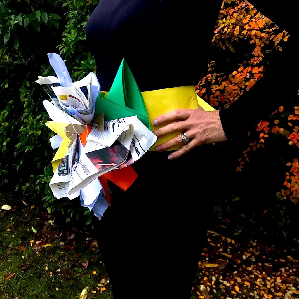
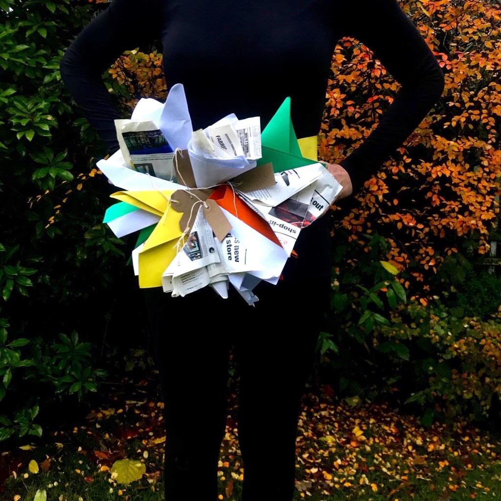
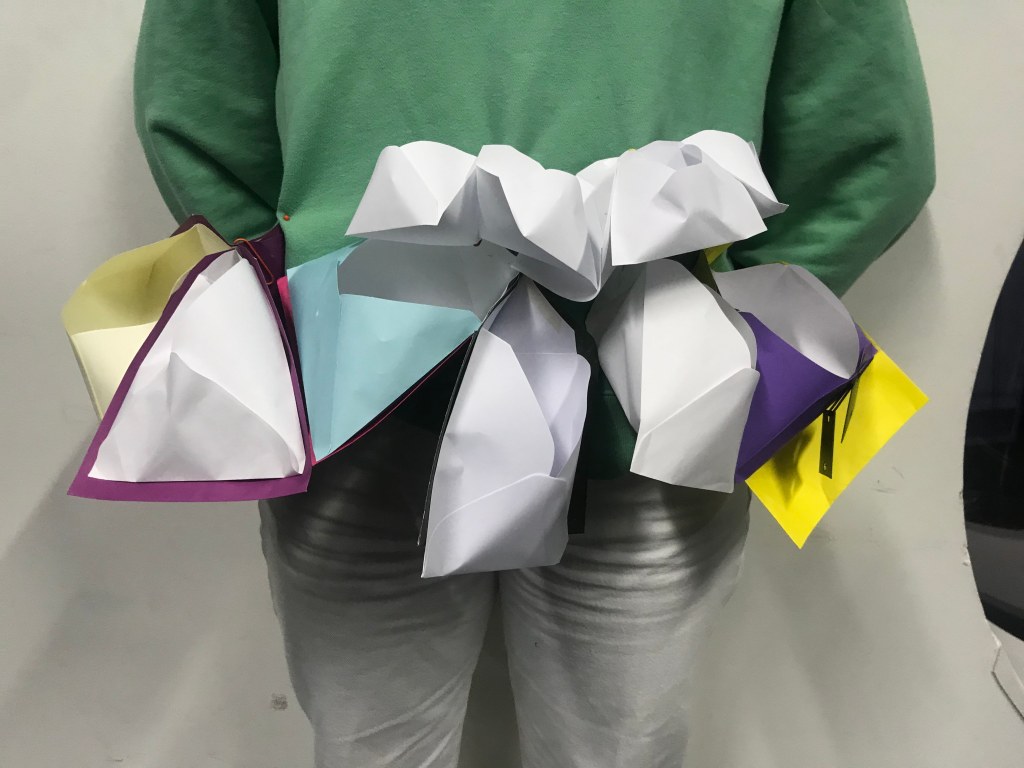
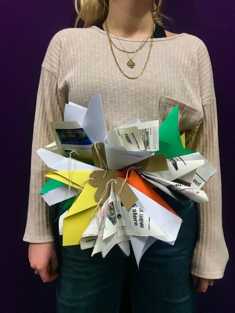
I was overall pleased with how my final accessory outcome turned out, I managed to create a thick, durable waistband out of card which gave the illusion of a belt, where I was then able to attach the envelopes and paper structures I created. In terms of my shoot I wanted the colours used in my accessory to be highlighted as much as possible which I created by dressing my model in all black, the colours in the background I believe to be really effective as they reflect many of my colours I used in the accessory.
To begin accessories week I was told to bring in any form of recycled or environmental friendly material. I brought in used envelopes which I planned on turning into an accessory of my choice. The benefits to using paper envelopes means they are easy to fold and manipulate into any shapes. From playing around with the structure of envelopes I thought of exploring origami style fashion which gave me lots of ideas for creating a 3D style structure as an accessory.
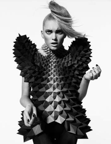
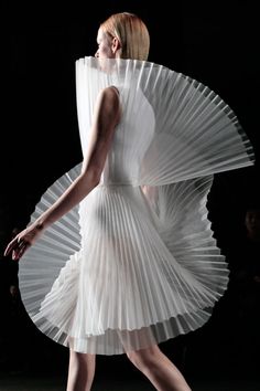
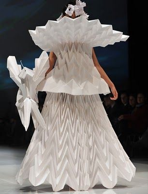
Origami is an art culture with over a thousand years of history, it is the art of folding any type of materials to create sculptural designs. When people hear of origami fashion, they may think that the garment is made by folding without any cutting or stitching. However, origami fashion also refers to the process of quilting and pleating, as presented in Chanel’s Origami Bag collection designed by Karl Lagerfeld.
This image was taken from my first day experimenting with creating a structure out of envelopes, I found this exercise really helpful as it made me develop a shape and style which could be used for my outcome. I was then told to research a role model of mine who would be relevant to my project to be used as a muse. I decided to use Karl Lagerfeld, as shown above in my research as he also explored the trend of origami, as well as being a huge influence to many upcoming designers. My task was then to choose one full body image of him, to be multiplied and stuck into my sketchbook so i would then explore the placement design aspect of my accessory, and to see where it would fit best on the body. Even though this was a good idea, I found it wasn’t that useful for me as I was already stuck on the idea of creating a waist belt accessory.
To progress into creating my final design I really wanted to incorporate more colours, textures and materials which gave me the idea to use recycled card, newspaper and magazine pages to create different textures and strength of paper throughout my outcome, also giving it a better overall shape and structure. The luggage labels seen came to my mind when thinking of envelopes, as people often use labels instead of cards to save money and be more sustainable.
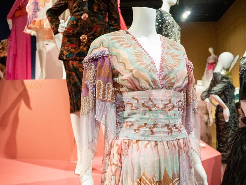
To begin illustration week, we were told to research a fashion illustrator who’s designs inspire and influence us, my designer of choice who’s work really stood out to me was Zandra Rhodes. Her style as a designer uses lots of bright colours and interesting styles designs and patterns on her garments, which i have taken on researched in my design board. To expand my knowledge on her style of illustration i visited her ’50 years of fabulous’ exhibition at the fashion and textiles museum.
Her first prints were Pop Art-infused commentaries on the world of Sixties Britain; the designer felt that there was inherent structure within the pattern that could work with and enhance the shape and construction of a dress. With this concept as a starting point and with her distinctive approach to cut and form she produced her first solo collection in 1969.
Workshops
This past week I have been experimenting in drawing workshops, the first workshop consisted of drawing a body figure in front of us for 3 minutes, with each drawing having something missing, e.g. a head. We then placed one of our collected photos (of faces, arms and legs) into this missing gap, from this I learnt composure of the body and trying to focus on one aspect of the body in front of me, as well as not creating ‘perfect’ illustrations as sometimes they can be the most effective. I find these short tasks quite stressful as my personal style of fashion illustrations tend to be as neat and precise as possible.
Another workshop I took part in was mark making, this is an element of drawing I always try to incorporate into my designs, as its an effective style of pattern creating. In this workshop I was experimenting with lots of different types of marks, personally I find that just choosing one element of mark making such as cross hatching can be most effective by being used with different thickness of pens and colour, as well on various surfaces.
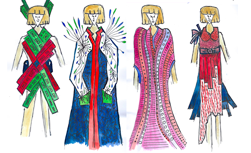
When it came to designing my final illustrations, I kept in mind what I had learnt in the workshops about being less precise and clean lined in my fashion illustrations. I think the designs above represent a line between precise and imperfect illustrations for me, as I hand drew the illustration models, where as usually I would trace off a template. I also tried to use more rough tones when adding colour and mark making. The colour tones I applied using watercolours and fine line pens, watercolour paint gives a nice effect when blending contrasting colours, and the fine liners are necessary when incorporating elements of mark making and patterns over the top of the paint.
When I continue creating fashion illustrations in my next upcoming projects, I am excited to use the skills I have learnt this week and incorporate them into my future work when designing for garments.
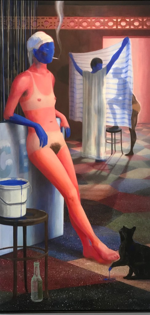
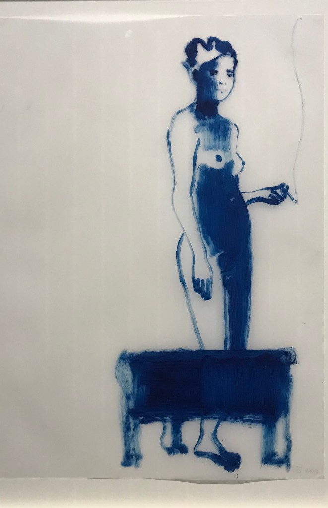
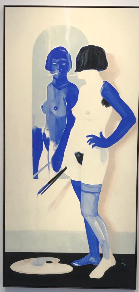
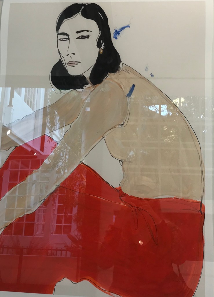
Illustration week was begun by a a visit to The National Portrait Gallery, Stephen Friedman Gallery, Fashion Illustration Gallery and Tate Britain. With the intention of taking photos and collecting research and drawings to help develop my illustration project.
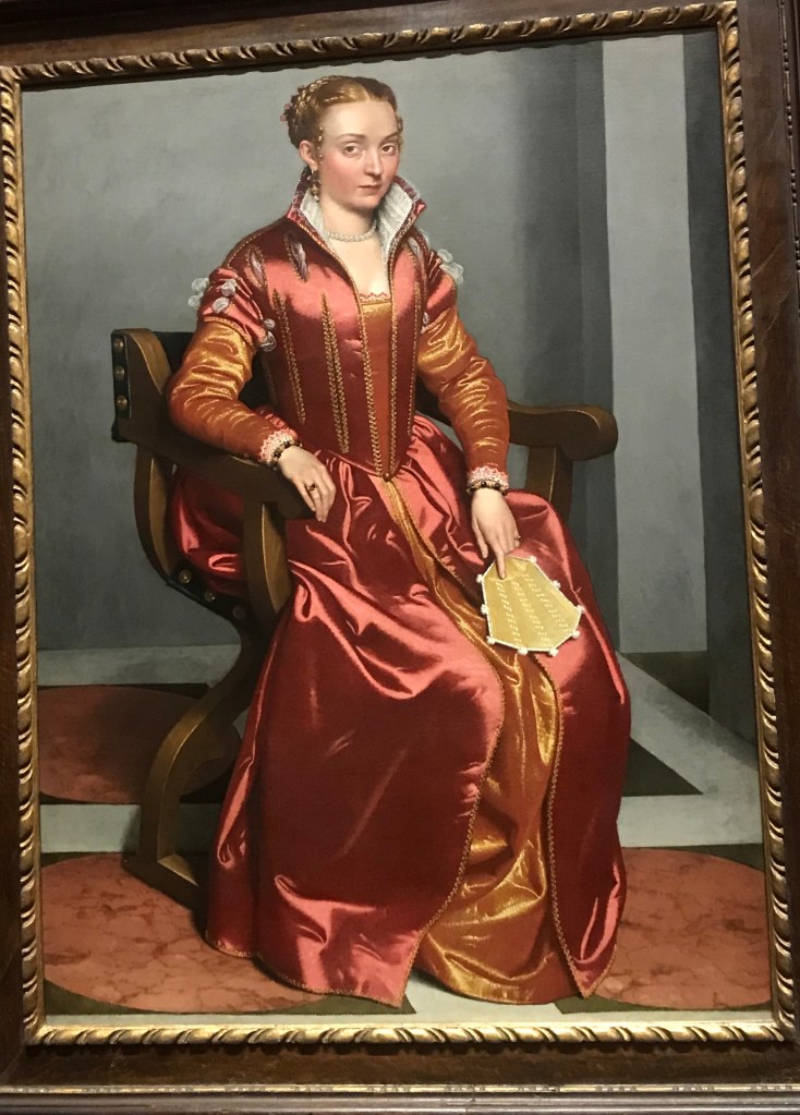
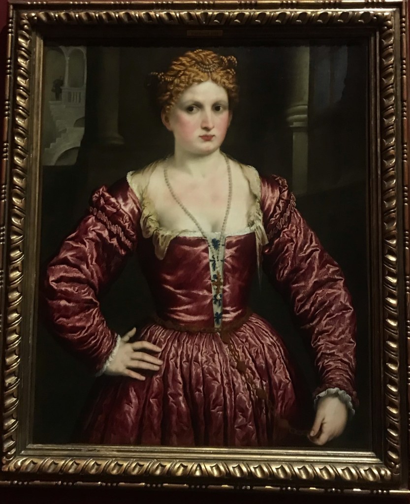
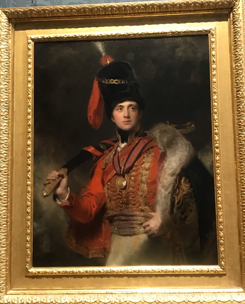
These three images were taken from the national portrait gallery, where i was exploring the old styles of garments painted on the portraits, for me i didn’t enjoy this gallery as i don’t feel inspired by contemporary portraits and found it difficult to draw sketches from these in my book.
The Stephen Friedman Gallery was very inspiring for me, as it pushed me to try out a new style of illustration, using thin watercolour lines to outline shapes and drawings to create an image. Some of the paintings in this gallery i felt confused by, but i enjoyed experimenting with watercolour in my book whilst exploring his work.
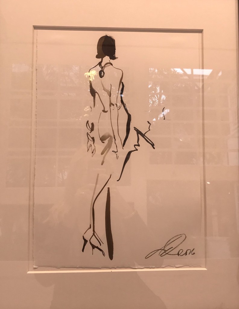
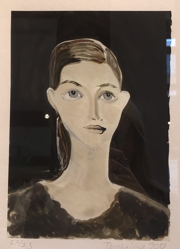
The Fashion Illustration gallery was my favourite, i love the use of simple, minimal lines to create an image as shown in the second picture, the other two images were interesting with the way they used simple colours to add definition.
When visiting the Tate Britain we were given tasks of drawings certain people, objects or elements of the gallery. This was to create multiple quick sketches, developing our illustrations further when under the pressure of time. I found this exercise enjoyable and it helped me develop my personal style of illustration using mark making and quick rough lines.
Please list and describe your main areas of strength.
Story telling
Creative thinking
Styling
Problem solving
Communicating
I believe my main area of strength comes within designing my own patterns, either by taking inspiration from images or other designer’s work. Throughout my sketchbook I have included a number of pattern designs on each page relating to the given theme or workshop I had been covering, this is something I really enjoy doing and I would like to try and include it as much as possible in my future work as this is the aspect of design I would love to develop a career out of.
Personally I found that my creative thinking was put to the test when having to develop an idea out the given theme of error, being such a broad word I found it hard to stick to just one idea and having to narrow that down to creating my own research which then flows into garment designs and ideas.
Throughout the workshops I learnt the basic ways of styling fabrics by the technique of draping, these workshops I really enjoyed as I was given the freedom to drape in whatever style of shape I desired, finishing with a final drape where I developed shapes to include in my designs for my final garment.
Please list and describe your main areas of development.
Time management
Research
Visualising my thinking process on paper
I have always found it difficult to balance my time management when working with multiple projects at once, I need to learn to put as much time and effort into my sketchbook aswell as my final piece, as I found for this project I focused too much of my time on creating my final garment instead of pushing my sketchbook ideas further, meaning I didn’t have as much work overall in my sketchbook as I had intended on having.
Visualising my thinking process on paper is also a large element I need to work on, as I can come up with many ideas for my project in my head, but I find it difficult to process them all onto paper for other readers to understand.
Please list and describe your plans for the developmental stage in regards to your creative direction.
Exploring different medium
Research different ideas, from a varied source
Collaboration
Planning ahead
I would like to experiment with a wider variety of pattern design by exploring cultural designs, looking at their colour palette and the history behind patterns created by designs in countries such as India, Africa, Europe ect.
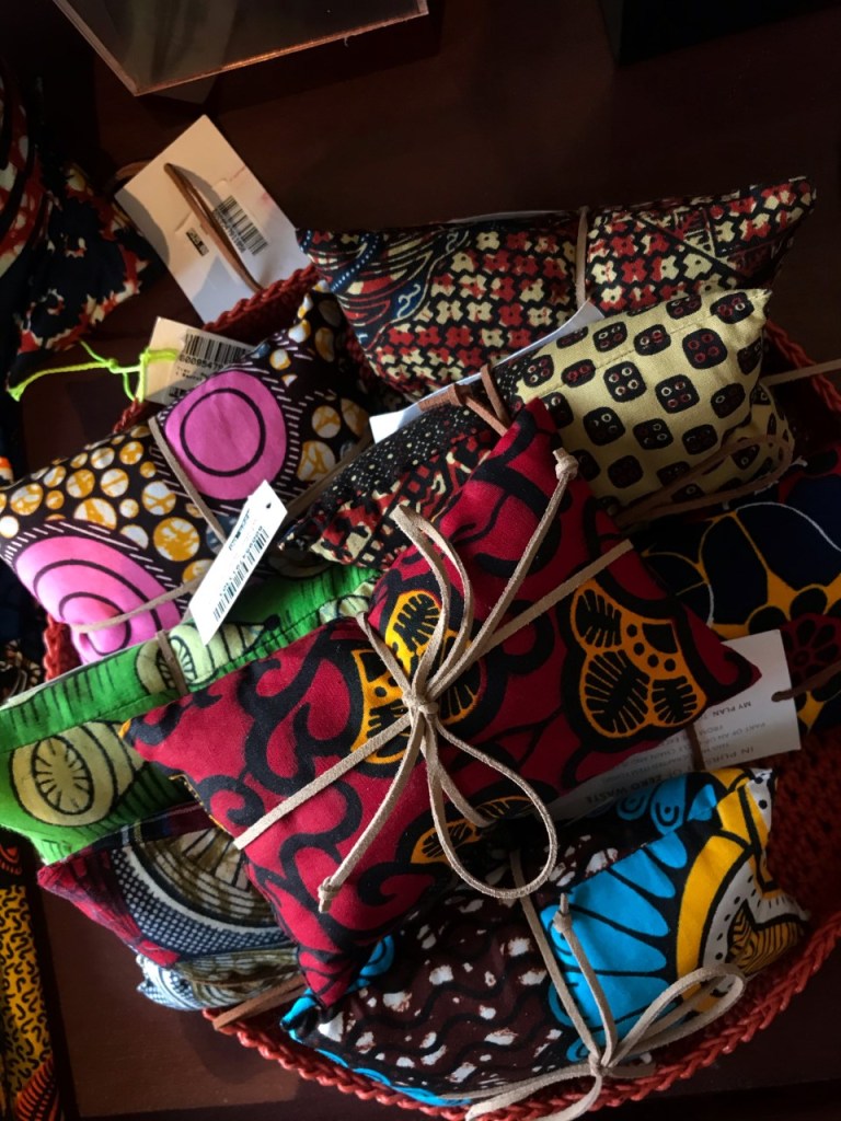
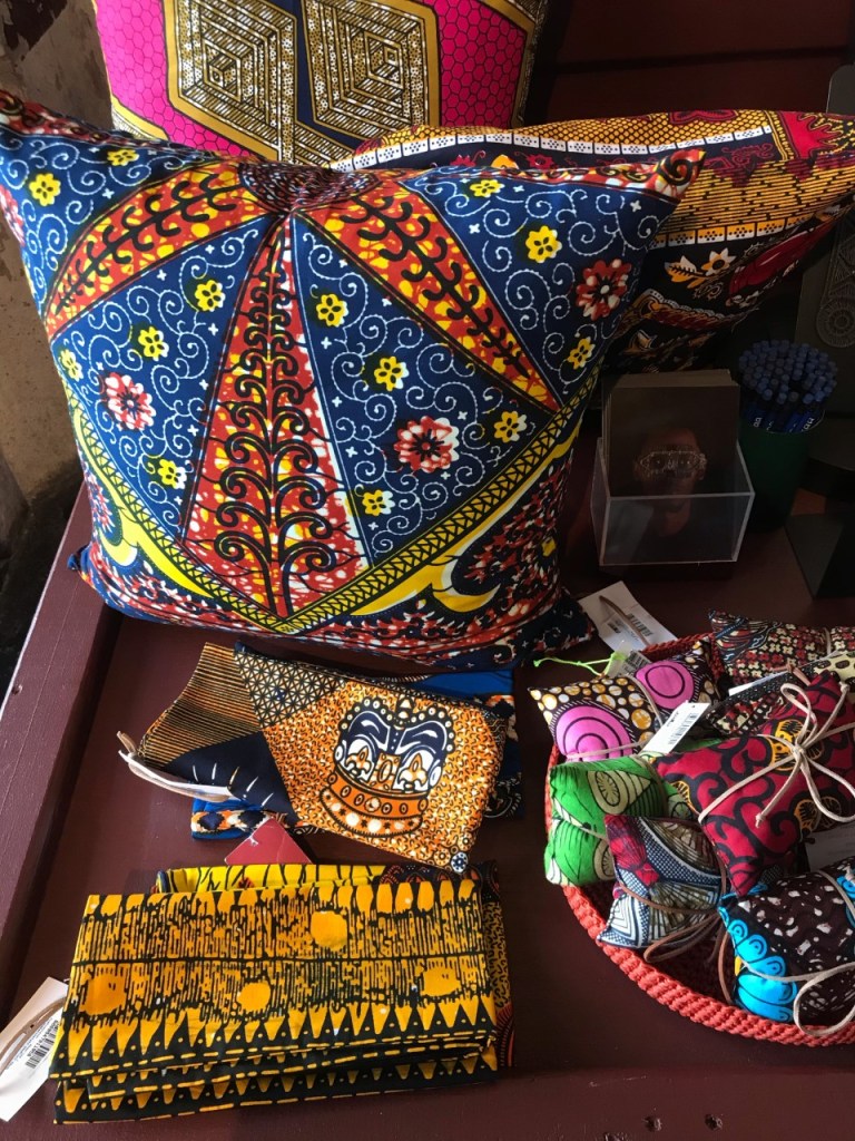
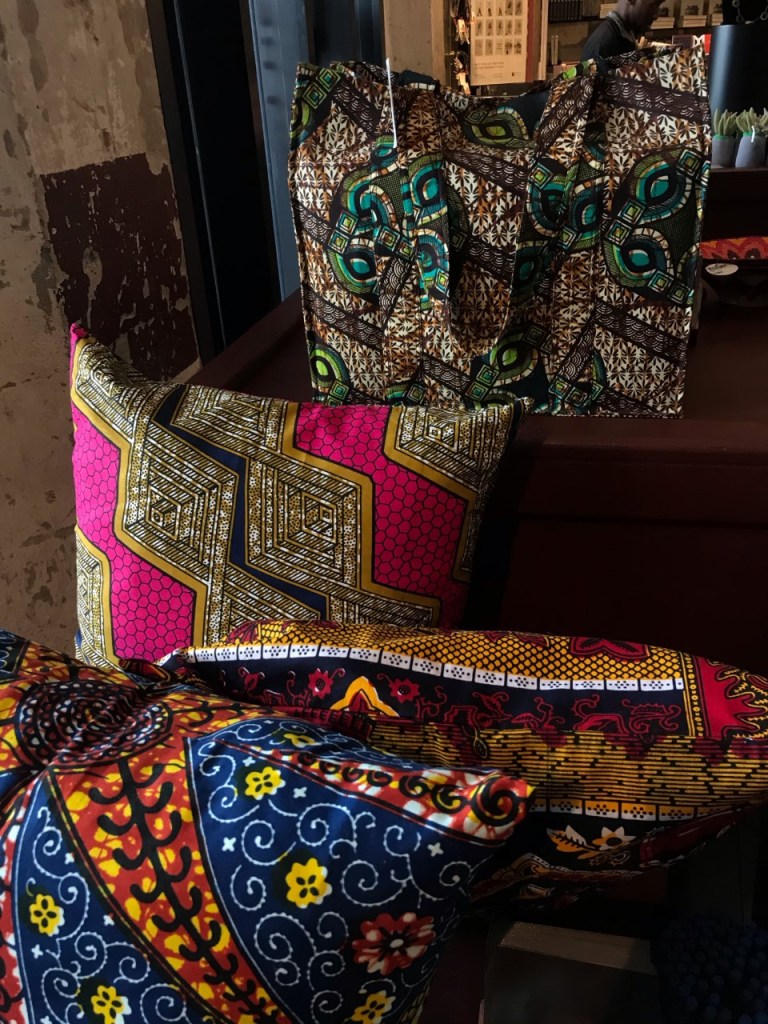
An upcoming trip to South Africa will come in handy with this research where I intend to collect lots of background information on their patterns and explore their garment markets and shops, collecting photographic evidence and fabric samples.
For my next project I intend to take what I have learnt from this error project, in the form of time management, my thought process, gathering further research and also pushing my ideas even further than I would normally to create extra designs and research. This would be very useful as well as challenging for me, as these are elements of my work I have always struggled with.
For my project relating to Black History Month, the subcategory i have decided to explore is the patterns, colours and style that go into the costumes at Notting Hill Carnival, and how they all take inspiration from traditional African designs.
Notting Hill Carnival is originally known as a Caribbean Carnival, when it was held in St Pancras town hall as a response to the problematic state of race relations at the time, and a celebration of the end of slavery. Recently it has been viewed as a dynamic celebration of London’s multicultural diversity, but still holding its original traits as Caribbean culture. The Caribbean culture has historically been influenced by African and Amerindian traditions. For my exploration of the style of patterns and colour that go into the Notting Hill Carnival costumes, I will be using the holiday I am currently on in South Africa to collect photos and fabric samples of interesting and colourful African designs. By visiting traditional markets and shops, exploring their signature colours and styles which i can use as inspiration for my work and incorporate into my design board.
As for my research on significant people who are inspiration to Black History Month, I begun by exploring role models who changed the stereotypes for black women. Elizabeth Keckley was a huge inspiration, as being born into slavery, she worked her way up to become a author, civil activist and successful seamstress to then finally open a dressmaking business in 1860. Her talents in dress making earned her enough money to buy freedom for herself and her son.
Ann Cole Lincoln has a similar life story as Elizabeth Keckley. Born in 1898 she was the great grand-daughter of a skilled seamstress slave and white plantation owner. She was known for being the first African/American who become a noted fashion designer, her designs were favoured by wealthy and socially prominent women, these women often told her to sell her designs for hundreds of dollars less than her competitors.
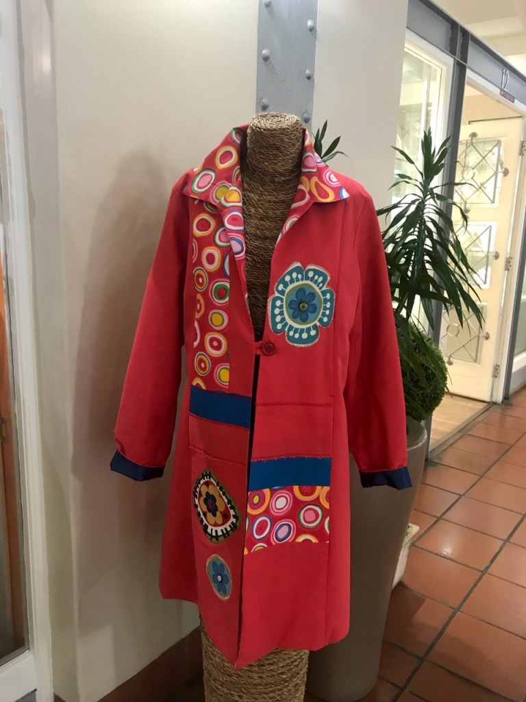
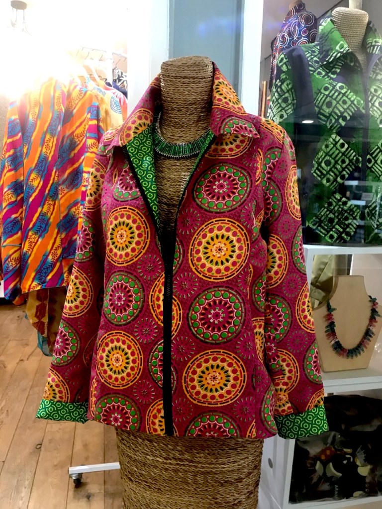
I begun my research in Cape Town, by visiting contemporary shops which are very popular with the black and white South Africans. I found the colours and designs they use on their clothes really beautiful, and not something you would commonly see back in the UK.
These patterns all follow a similar style of colour, design, details and shape, I love how bold they are and how all the colours compliment each other and blend well together. Another detail I noticed on the jackets were that many of them had been designed not only on the outer side, but they also have a completely different use of colour and pattern inside the jacket, so it can be worn inside out, which is a hugely popular trend and something I wold like to try include in my final garment if I have the time.
Although my concept board revolves around costumes seen at Notting Hill Carnival, I picked out three shapes that I found interesting to expand some designs from. When developing my design ideas my aim was to ideally stick to these three shapes and use a bright colour palette, as this best represents African designs to me.
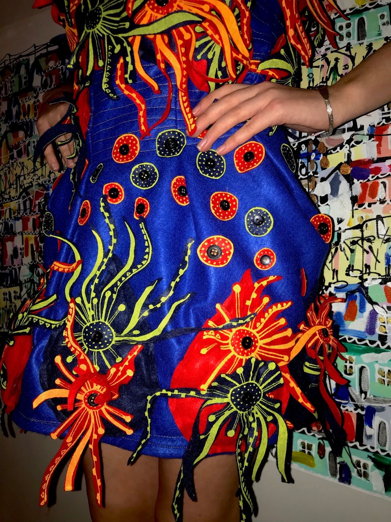
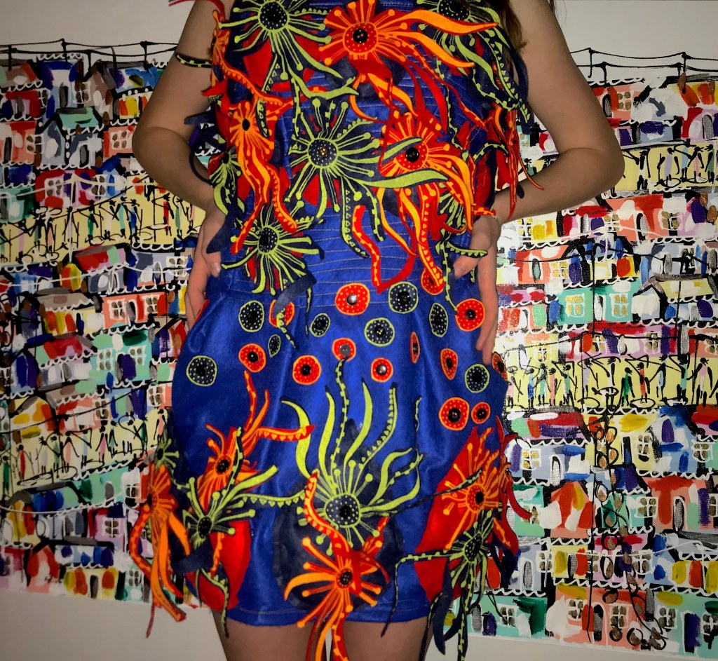
In terms of thinking about materials to use, I wanted to create a texture that would be soft to the touch, but also make it as bold and 3D as possible. Felt is the first fabric that came to my head, not only is it durable but it also has a great stretch which means its perfect for layering and then stuffing it. As I have experimented with felt lots in the past, this gave me confidence in my ability to create a final garment from. I also made a small experiment with weaving wool in my sketchbook, also this experiment turned out well and is a great way of expressing colour, I feared it would take up all of my time for this project which isn’t ideal.
Using my design ideas I had expressed in my book, I decided to use screen printing to transfer my work onto the felt. I was really happy with how these prints came out and to mix it up I experimented with using different colours of screen print ink and the colour of my felt I was printing onto.
I loved how my dress came out, although I went over time in terms of uploading a photo of my final outcome, it was something that I felt was necessary to take my time with, to produce the best quality of work that I was happy with. My aim for my final outcome was to design a garment that would be suitable for costume wear, as well as expressing the colours and patterns seen in traditional African garments.
The painting in the background of my shoot, was created by an African artist who lives in a township in Cape Town, I thought this would tie in elements of where my design ideas came from as well as using the colours and style of the painting to help make my garment look even brighter and bolder.
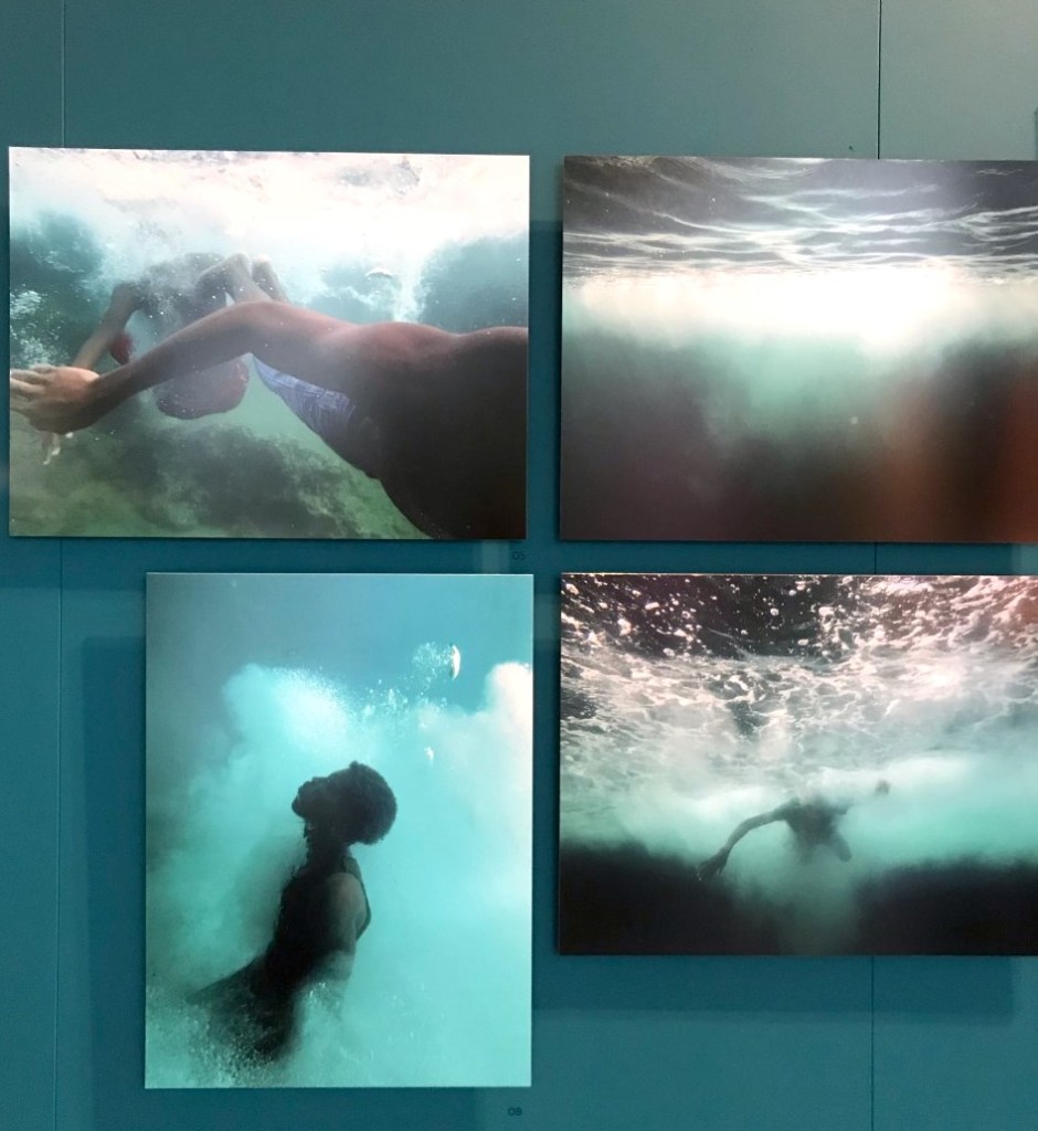
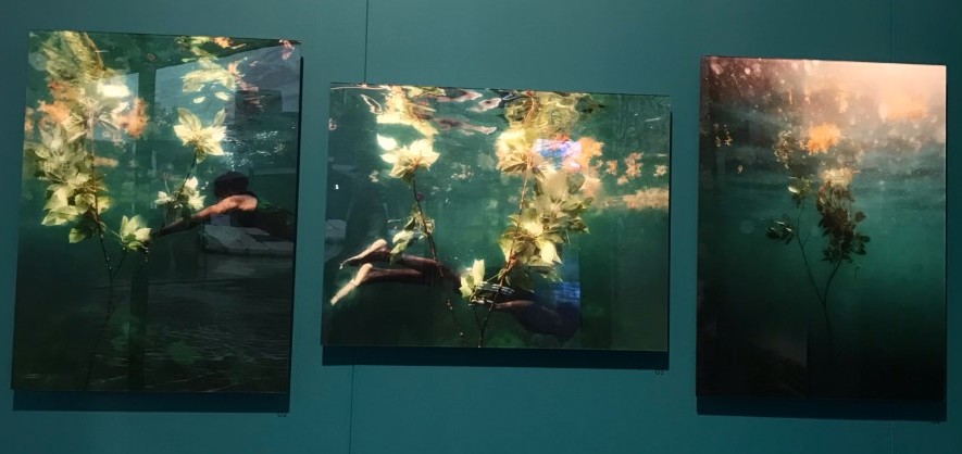
Nadia Huggins created her exhibition showcasing the boundaries between land and sea, through a collection of filmic and photographic work captured on the island of St Vincent and the Grenadines.
My main attraction to this exhibition was the style of layout the artist had chosen, by choosing similar style photographs all positioned on multiple canvases next to each other gives the impression of a story being told throughout the photos, as if they are portraying a timeline of events. The exhibitions aim is to invite the viewer to contemplate the power and expanse of the ocean which is juxtaposed against communities who are most effected and nurtured by it.
‘The relationship between myself and the subject is also explored within this paradigm. The subjects are aware of me while posturing but lose this cognisance when they sink into the water, it is the movement that tells the story’
The idea behind Nadia Huggins work is to capture intimate scenes of a group of adolescent males, documenting a choreography of bodies underwater. The work transverses an irradiated border between deep submergence and spectral surfaces, framed by dramatic costal landscapes, the work reveals youthful vulnerability in her subjects.
Although this exhibition isn’t relevant to my choice of theme for Black History Month, i think it was a beautiful exhibition that uses powerful photography to tell a story.