Industry Project – Balmain

Group Presentation: https://docs.google.com/presentation/d/1i6PbTEIzkIoQTUIeyqWb1daN53CMR9dbjvjHCigXU4U/edit#slide=id.p

My role for Industry week being a designer was to re-brand an accessories item for Balmain, as this project was a group task it was important to consider the roles of other people in my group and make sure our research and concept idea was linked together so we could produce a successful garment as a team.

To begin our research we visited the Balmain store in Selfridges to gain a idea of what their store layout looks like and to also look at their current stock. When looking around Selfridges, the Balmain stand was almost unseen as it was located in a corner which came across as simple and unnoticeable, we found that the clothing racks were pretty bare compared to most other brands around, as well as being presented in a cheap, plain way with very little colour to make them stand out.

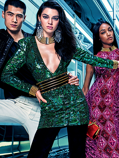
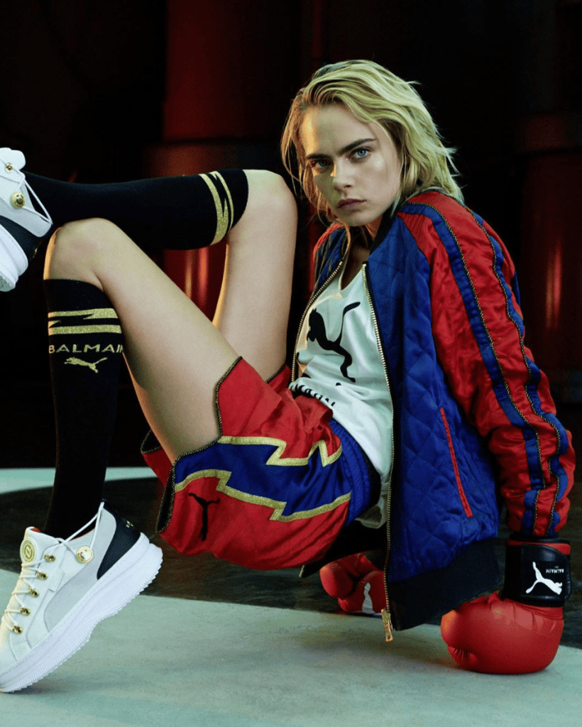
On our first day working as a group to create our presentation, we decided roles for each of us to complete in the day as a way of collaborating individually to the project. I begun my research by collecting images and information about previous collaborations that Balmain has created with other brands, two popular collabs were Balmain x Puma and Balmain x H&M, these two collaborations were a collection of very opposite garments. Balmain x Puma was a new style for Balmain as they introduced unisex sportswear to their brand which attracted a younger generation of customers as it appealed more for everyday wear. Balmain x H&M is very much aimed at the current Balmin customer as they stuck to their signature colour tones of gold, black and green as well as aiming the collection for smart evening wear. The aim for researching this was to create our new customer profile and to determine what our age range and style of occasion it was to be aimed at.
Once we had our customer figured out we moved onto planning what we wanted our garment to look like, thinking about sustainable fabrics, trims and colour.

Looking at the current Balmain trends, we found that their signature colour palette ranges from blacks, whites, gold and emerald green being their statement colour, from this we decided to stick to a black and emerald green colour palette, but introducing small tones of white and gold when appropriate.

In relation to my role as an accessories designer i decided to design a fabric waist belt, the intention behind this was to add a feminine touch to bring the garment together by using a black polyester suede fabric to give it a high end look, with details of a white fabric ribbon to layer over the suede, as well as using a tassel string to tie up the waist belt.
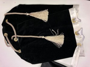
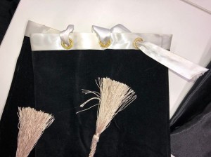
I stuck to a neutral colour palette, bringing in touches of gold. I didn’t want to use any tones of emerald green as it was being heavily used on the rest of the garment.
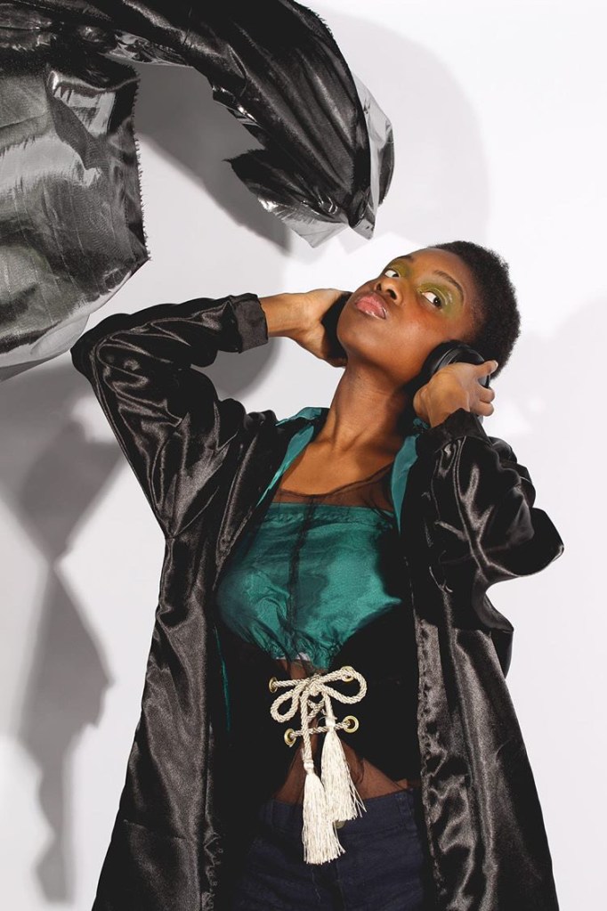
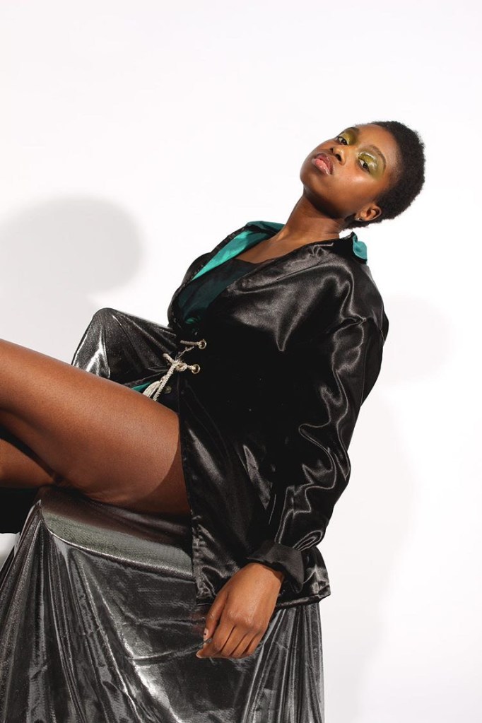
When it came to styling our studio shoot as a group, we decided to keep the background plain and simple so the main focus was on the garment produced. In terms of styling the model with our finished garment put together, we experimented with layering the belt over the jacket and under the jacket, as well as using shades of green makeup on her eyes to bring out the tones of green in our garment. Props such as the headphones were used to express how we have related to the hobbies of our customer profile.
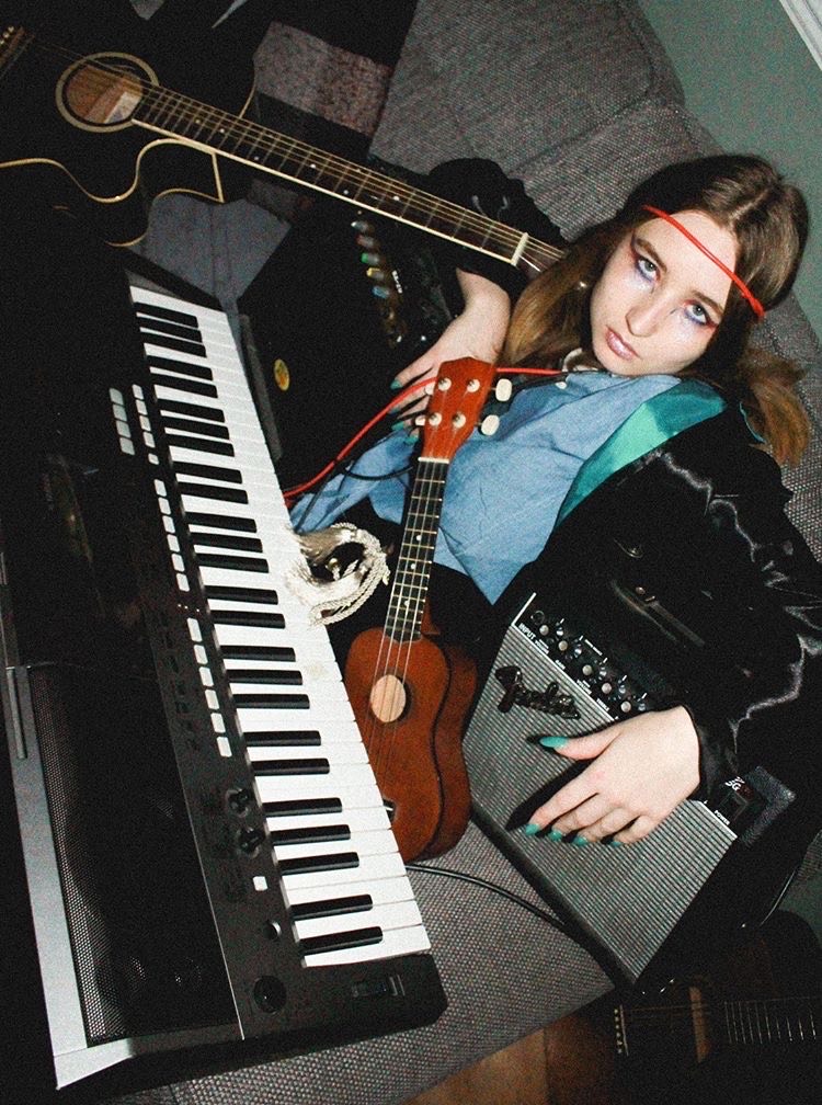
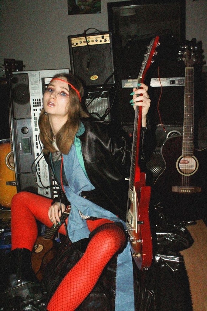
In terms of our location shoot, we also intended to incorporate music into our styled photoshoot set which the two promoters in our group set up and shoot. We also used this same location in Shorditch for our fashion film.

Fashion Film: https://drive.google.com/file/d/1UQGMxfBcxDpPwSSzksAZE32f2zb3xM49/view?ts=5e3d6017
FE Workshop – 50 Years of Influence

My fifty years of influence is aimed at Alexa Chung, who is an upcoming British fashion designer, presenter and contributing editor to British Vogue.

I have been researching how she has built her current fashion brand by exploring the industry of fashion in depth, she’s interviewed past, present and emerging designers, aswell as exploring the faults, stereotypes and thrills of creating a career for yourself in such a competitive world.

Alexa Chung’s career in the fashion industry begun after being scouted to model for a underwear company in London at the age of 15, which continued for a year until she decided to turn her career towards presenting and television commercials, in an interview for Vogue she explained how leaving the modeling industry was the best decision she has made, as being used for other creators work meant she had no opinion on how she was to be seen by others. Until entering the television industry, where she found that her opinion was just as important as the people she worked with. For me this is really important, as I struggle to work with people who can’t accept other ideas or opinions other than their own, which is believe is an important skill to have in life.

Pursuing her career in television allowed Alexa to attend events as an interviewer, where she had the privilege to interview well-respected designers such as Karl Lagerfeld, Oliver Rousteing, and Valentino. These interviews changed her perspective of designers in the fashion world, and gave her the idea to go and explore how creators can reinforce fashion’s public image in a positive and progressive light. 

I believe that having an interest of working in fashion, or being inspired by fashion is more than just an image which people perceive you, it’s the only way that people can express themselves to others in a visual way, many people link fashion to art in an emotional sense, and making themselves feel good in their own bodies. 

Currently in life many parents are discouraging their children to pursue their dreams of working in the fashion industry, as it is perceived as a privileged industry, which is not supportive of upcoming designers who come from low-income families.        Alexa Chung interviewed Sarah Mower, a renewed fashion critic and columnist for publications including American Vogue, who is internationally acclaimed for her forthright and decisive critiques, aswell as being an ambassador for emerging talent as part of the British fashion council, who has set up an education foundation where they have been raising money for scholarships in hope to gain awareness in high end companies. They believe that it’s important to help fund students who have the ambition and talent to immerse themselves as futuristic designers, which the fashion industry is constantly on the lookout for via grants and mentor schemes.

Alexa launched her contemporary priced ready-to-wear label in May 2017. In an interview with business of fashion, she explained how it was only after she had worked with a number of collaborations and creative projects with other fashion labels that she built the confidence to pursue her own business, which will sell denim, daywear, evening wear and jewelry. This collection has been sold at luxury retailers such as Selfridges, Harrods and Galleries Lafayette.

Alongside her label, she has a large following on her YouTube channel, which is designed to not only promote her own style and designs, but also to interview designers and show her audience behind the scenes of well known brands creating collections and preparation for couture shows, where you get a raw feel for the realistic lifestyle of all the many roles needed in the creation of a fashion collection. Recently I watched her two-part documentary where she takes you behind the scenes of the Dior women’s ready to wear S/S 2020 show, before watching this I had no idea how many different jobs and people were needed to create such amazing clothes, I learnt a lot from watching this documentary aswell as many other series she has featured in, including behind the scenes at London Fashion Week and uncovering fashion industry secrets with Vogue.

Harvard Reference

Alexachung.com. (2020). Alexa Chung Official Fashion Line – ALEXACHUNG. [online] Available at: https://www.alexachung.com/ [Accessed 2 Feb. 2020].

Bibliography

Outcome

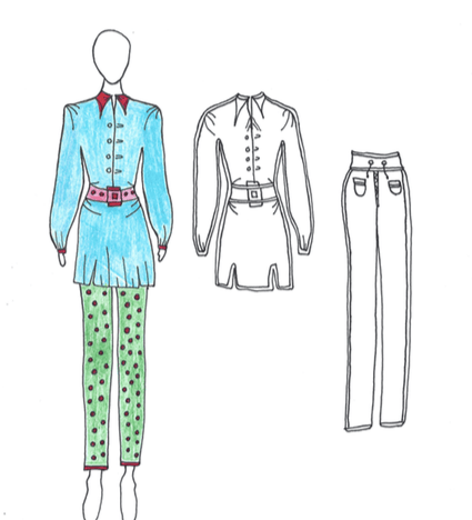
Two piece collection inspired by AlexaChung label. Using the materials of 100% green dyed denim for the trousers, 98% cotton jacket and belt with 2% elastine and 100% viscose lining.

River Island Live Project – Customer Profile

To create my customer profile I decided to visit my local River Island store in Guildford to get a feel of the average age and gender of people shopping in store. I decided to create my collection targeting the age range of 20-30 year olds, as I found when looking in the store the most common trend was aimed at business women/ young adults as it featured lots of suits and smart occasion wear.

My ideal customer for the collection i designed is a business women who shops for comfortable but sophisticated clothing, suitable for the warm weather of spring and summer. I want my collection to be in a price range for high street wear but not too cheap as my aim is for my clothing to be made out of high quality material which is sustainable and durable.

I will also be looking at the brand ‘and other stories’ which has a similar customer profile to me but designs much plainer garments suitable for the summer, compared to the river island style which uses lots of trims and brighter colours.

River Island Live Project – Ideas, Research and Final Collection

To begin the live project and determine my concept for the brief, I begun by browsing online on the River Island website to get an idea of the current trends and upcoming seasonal styles. I also created a A/W mood board and colour board inspired from the current trends on the River Island website, as well as making a S/S mood board and colour board to help me decide which season i wanted to design my collection for.

My first impression of the website was that it is aimed at students to young adults, as the homepage features lots of student discounted deals, and offers. I also noticed it has the options of browsing womenswear, menswear and kids, which shows that their customer profile covers most ages. After browsing their current and upcoming styles I decided to focus on women’s spring/summer wear, as I felt most inspired by the colours and styles that River Island has designed for their upcoming spring/summer 2020 collection.

Trims, Colour and Fabrics:

Looking on River Islands website i found that trims are an important element in their designs for S/S wear, they incorporate lots of lace, zips, gathers and buttons in their clothing. To expand my research i looked into high end brands that use gathers as a major part of designing. Jacquemus is a french brand who’s garments contain no patterns trims or bright colours other than experimenting with draping and creating gathers, i love his designs as they are so simple yet powerful.

I have also been researching a similar high street store to river island ‘and other stories’. The clothes designed for this brand tend to be simple and use pastel tone colours which appeal to the 20+ age range. The reason for researching this brand is when thinking of design ideas for my collection I would like to design seven garments taking inspiration from river island with their bright colours and use of trims, as well as designing seven garments in a more low key style using pastel colours and lots of gathers and draping.

When thinking of a colour palette I didn’t want to narrow my research down to a few set colours, as i find that in the spring and summer people like to experiment more with colour mixing and i find you can get away with wearing and mixing together whatever colours you like.

Breathable fabric is essential in the warm seasons, which is why for my fabric board I have looked at Silk, Linen, satin and cotton. Keeping in mind that my collection must be sustainable, i did some research on WGSN for sustainable replacements for my fabric choices.

Overall I am happy with the outcome of my two illustration line up pages, I think the colours and styles I have chosen are ideal for spring/summer wear. My feedback in crit was that I confused my audience at first by showing a A/W mood and colour board as well as having a S/S mood and colour board which i can understand. I was also told that I designed a collection too large, which could be overwhelming when showing it to the fashion buyers.

Fete Accompli Project

For this collaborative project all foundation students were divided into groups to create a fete revolving around four words we were given, these words were:

  • Ghost
  • Anticipation
  • Parisian Terrace
  • Rollercoaster

The benefits of mixing with other foundation students is that we had one or two members in our group from each foundation pathway, such as fashion and textiles, fashion promotion, design and media and VCD, which when planning out our ideas for the fete meant that we had the freedom to include aspects of design from each category.

Our original idea was to create a virtual reality experience where (using the skills from design and media) we would create our own visual goast rollercoaster ride for our classmates to come and experience, also using skills from the design students to decorate the outer set in the style of a haunted Paris theme. Unfortunately we were unable to get hold of any virtual reality equipment so had to rethink our ideas.

After exploring our options via equipment available to us and managing our time, we decided to come up with a theme which would have a deeper meaning but still being interactive to gain an audience. This idea was found by taking apart the word ghost and digging deeper into how and where the idea of ‘a ghost’ came from, bringing us to the theme of death.

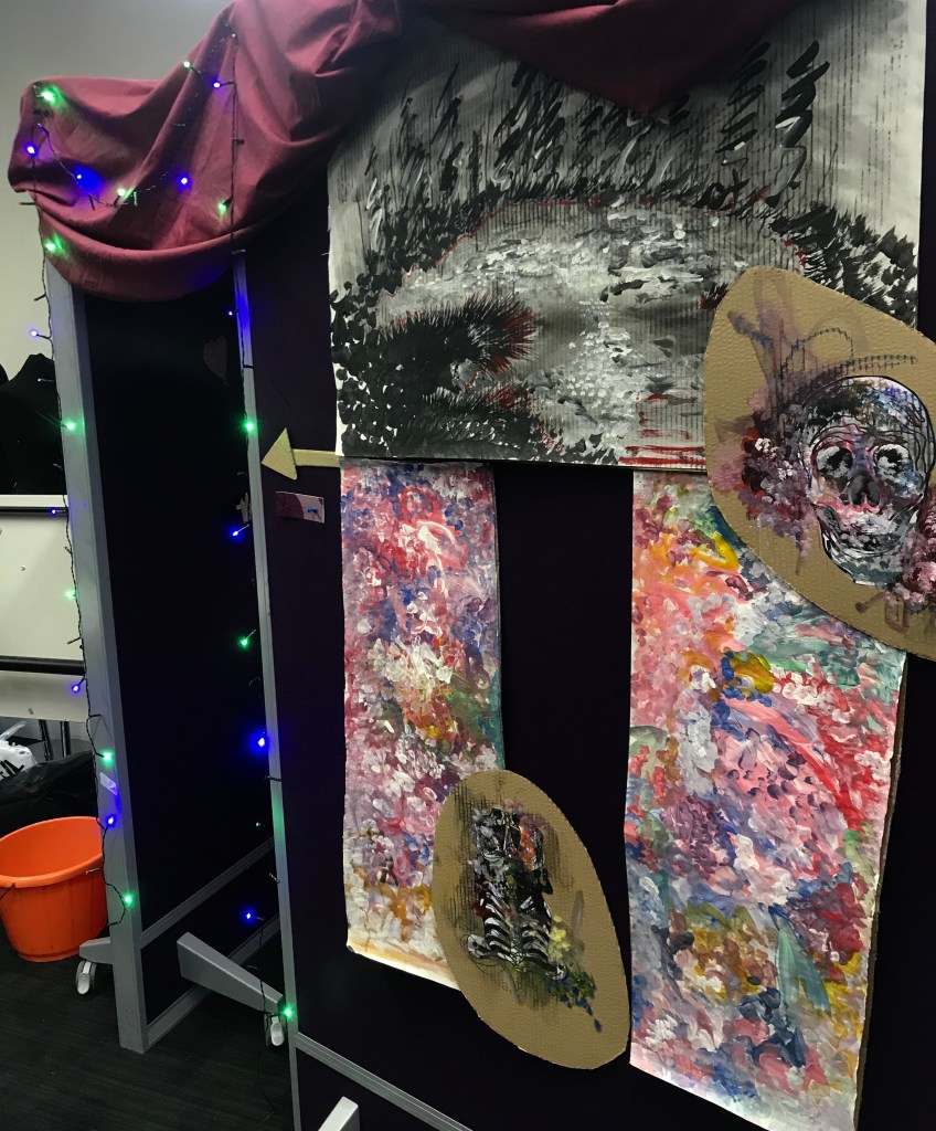
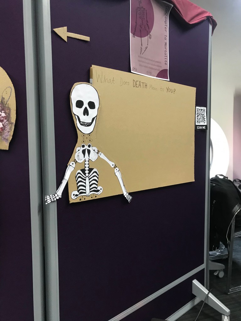
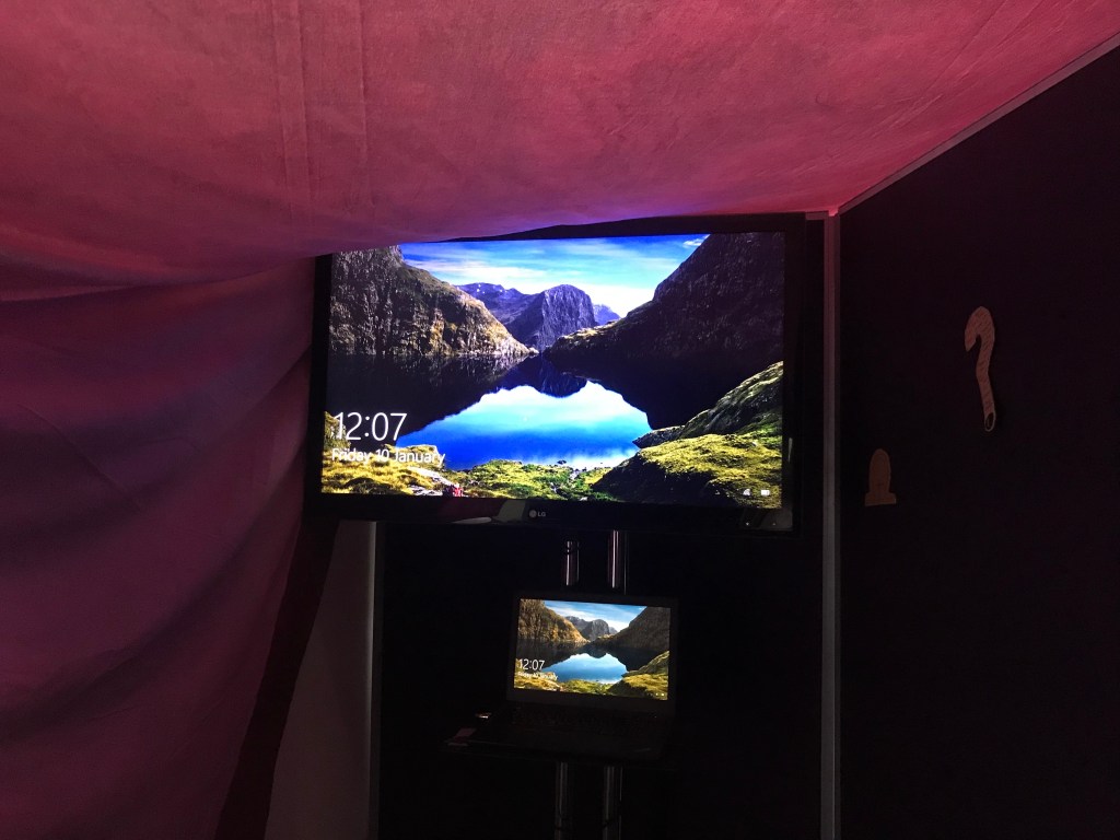
Our proposal for the fete was to create a short film asking a few of our classmates and teachers what death means to them, this would then be projected inside a inclosed blackout room, decorated with paintings and illustrations resembling what death means to us, outside our room we will continue the artwork as decoration but also to catch the audiences eye, we mixed it up with some handmade posters and a QR code that visitors can scan to access online merchandise.

As being one of the designers on the team i helped collaborate with the art work and styling of our stand, as well as helping to contribute to a number of the ideas for our proposal.

Our fete proposal is collaborative for our audience as they can take part in the filming of our short film and also have access to go inside the room and watch the film, whist being able to look at the artwork on the walls.

Final short film: https://youtu.be/xg-W9Vvomak

Overall i believe our fete stand was a success, we gained 25 tokens and had positive feedback from our peers. We also used all the words we were given, as our idea of death was formed from the words ghost and anticipation, we used the idea of the word rollercoaster in the form of ‘a rollercoaster of emotions’ for people to experience as they watch our film, and Parisian terrace was harder to include in our theme, but we attempted this by linking the colours and style of artwork with typical french paintings seen in Paris. Our fete was also all sustainable as the cardboard used to decorate was all unwanted, and the sheet used as a roof to our stall was an old cut off piece of material.

If i was to change anything about our idea, i would have included a interactive game which could also include a reward, as looking round other peoples stands the most successful and popular ones which gained the most tokens, included some form of hands on entertainment with a reward worth giving a token in for.

Prevent Project

Prevent is a Government strategy that was set up as part of a wider counter-terrorism strategy called Contest. This strategy is split into four work streams that are known within the counter-terrorism community as the “four P’s”: Prevent, Pursue, Protect, and Prepare. The purpose of Prevent is to stop people from becoming drawn into or supporting terrorism. Due to the current severe threat from terrorism and extremism in the UK, the Prevent strategy aims to prevent people from supporting terrorism or becoming terrorists themselves.

My brief for this project was to create a visual response to Prevent in schools and HE. Before starting this project I had no knowledge on the Prevent strategy, and found it really difficult to think of ideas on where I could take this project from a design point of view.

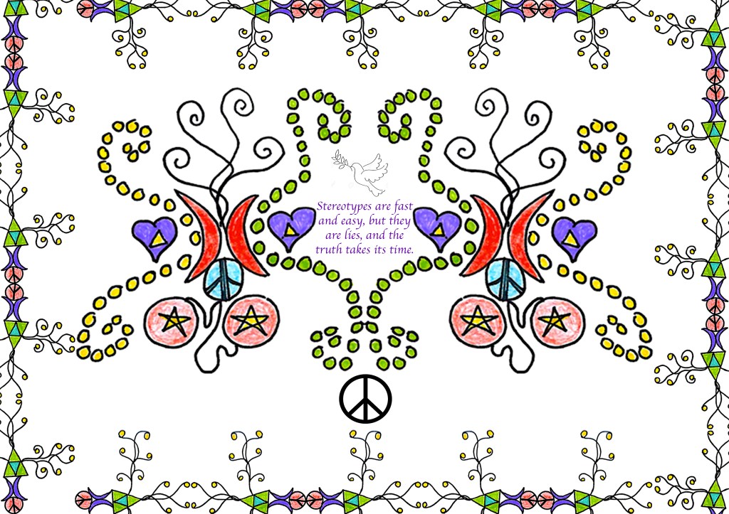
Stereotypes is a word that comes to my head when I think of global terroism. An article I read relating to the New Zealand mosque shooting in 2019 has a large title in bold saying ‘Around the world, the majority of victims of terrorist attacks are Muslim.’ Although this is not something I can comment on, it must be incredibly terrifying and difficult for muslim children growing up having to hear comments like this thrown at their religion and ethics. Feelings like this cause vulnerable people to rebel and defend themselves in many ways which can attract terrorism. This gave me the idea to design a poster which captures children and adults attention with colour and style, which will also contain one or two positive quotes and a large title with the intention of spreading uplifting and positive vibes.

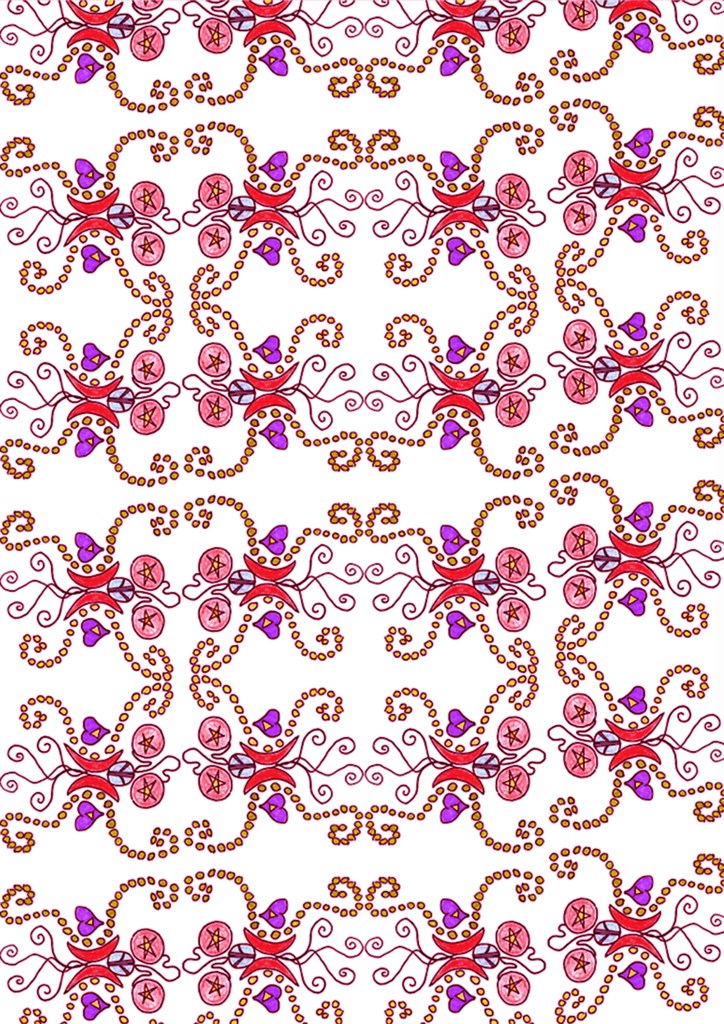
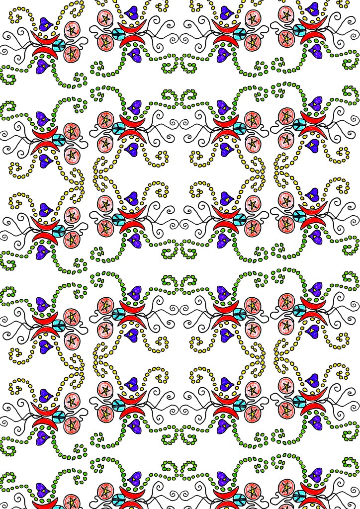
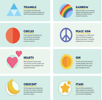
When it came to creating samples for my poster, I wanted to design using symbols and colour that represent emotion and feeling. After doing some research online I gained some initial ideas which I merged together and designed repeat patterns out of in photoshop.

I am really happy with how the samples above came out, I used photoshop to also adjust the colour tones and contrast. As well as using them in my poster i believe they could be used in designs for wallpaper and fabric prints to attract a larger audience.

My final poster came out as I expected it to, once I had finished creating it I realised that it probably captures the female attention more than male, but putting that aspect aside I like how all the colours and patterns all come with a deep meaning to them which people can remind themselves of when they see it.

Progressive Detail – Ethical/Sustainable Brand

It is important to remember to use sustainable fabrics at all times when designing, in the sportswear industry there is a common problem with fabric such as lycra, polyester and nylon being very popular fabrics as they are light-weight, wrinkle-free, long lasting and breathable. They are also non-absorbent in nature, which means that your sweat is not absorbed by this cloth but left to dry on its own..

The fabrics I have chosen to use in my collection range from..

  • Web Mesh
  • Recycled Polyester
  • Synthetic Fabric
  • Bamboo and Hemp

Web Mesh: Is a strong, self-supporting, and functional mesh fabric with yarns crossing each other in endless intersections. Open spaces between the yarns create a transparent effect and the fabric’s translucency lends a lightness and airiness to the appeal of the design.

Recycled polyester: Is simply polyester produced from recycled sources…bottles, industrial polyester waste, and even garments. The fibre won’t absorb or hold water molecules. So the sweat generated from our body won’t be absorbed by the clothing and this avoids sticking of clothing with our body

Synthetic Fabric: This breathable fabric is one of the top choices for athletes, as it can absorb sweat very easily to keep you cool when exercising. Sustainable synthetics derive from recycled fibres or from natural sources.

Bamboo and hemp: Are traditional substitutes for cotton and are slightly more ethical than cotton. Bamboo is fast-growing fibre without insecticides and pesticides and does not require replanting. Bamboo also transforms easily into yarn without great water usage and contains natural moisture-wicking properties. Bamboo is the most sustainable and durable option also for naturally sourced activewear textiles. Hemp provides natural UV-protection, but also holds its shape, stretching less than any other natural fibre.

Progressive Detail – Customer Profile

What will my Product look like and what fabrics will i use? My aim is to design a collection of sportswear garments which will be suitable for all weather conditions use. Fabrics will range from Web Mesh, Recycled Polyester, Synthetic Fabric and Bamboo and Hemp. In terms of colour I would like to stick to one colour per garment, including lots of white tones to contrast.

Core values and Issues? It is important for my collection to be breathable and lightweight, as when high intensity exercise takes place, sweating will occur to evaporate heat off the skin. If clothing is not breathable than there is nowhere for the moisture to escape. This causes moisture to build up inside the garment and on the skin resulting in the body getting hotter.

What type of person can you see wearing it? Is it in trend? From exploring popular sportswear brands seen worn on men and women from the ages of 18+, such as Nike, Adidas, Sweaty Betty, Lululemon and Gymshark, the most popular style of clothing for unisex is tight breathable polyester tops, jackets and leggings, as this material is durable, wrinkle-resistant, lightweight, breathable, and non-absorbent, which means that moisture from your skin evaporates instead of being drawn into the material. Being tight fitting they are also comfortable and flattering items of clothing to be seen wearing.  I have also been exploring the style of puffa jackets, as they are a very common jacket seen in ski wear, as well as being very popular in the younger generation at the moment for everyday outdoor-wear use. They have a signature quilted design with sections that are padded between the stitching. They are filled with down insulation or synthetic fibers, both of which can provide a high level of warmth depending on how well they are made and the quality of the synthetic fibers. Another attribute is that they are often very lightweight despite being very warm , compared to wool or leather, puffa jackets provide the unique combination of both warmth and lightness making them perfect for outdoor everyday activity.

How do my items of clothing compare to trends seen in shops and on social media platforms? How could i improve my collection? A trend i have noticed from looking through Nike’s instagram and website, is that they have been recently creating collections based around different colour themes, a popular trend recently is to personalise your own trainers online or in the shop for an extra price, by choosing your own colour combinations of threads, laces and insoles allows you to express your own style and colour palette making them very personal and unique to whoever designs them. Collections of colour co-ordinating sportswear is also a popular trend allowing the buying to purchase a set of activewear clothing or to have the option of pick and choose their own colour and styles of garments. This is something i could consider exploring when designing another collection to gain extra profit and customer satisfaction.

Progressive Detail – Trip Overview and Design Development

Our brief for Progressive Detail week, was to use our research from visiting the V&A, Dover Street Market and Nike Town, with the aim to develop and design our own item of sportswear, taking inspiration and including elements of design from historic garments and styles.

In these images above i wanted to focus on the ruching and gathering of the fabric. Gathering is a sewing technique for shortening the length of a strip of fabric to give shape and structure to an item of clothing, its commonly used in a very obvious way in historic fashion as it is characterised by low and sloping shoulders, a low pointed waist, and bell-shaped skirts that grew increasingly voluminous throughout the decades. Ruching, involves gathering, pleating or repeatedly folding a fabric as an embellishment. This is then incorporated into a pattern, when making clothes, on sleeves, bodices, waistline seams , on accents like collars, belts, on accessories like sashes, hats etc.

Dover Street Market, i found had a very wide range of high end designer clothing, with multiple different styles, many of which contain victorian style clothing relating very well to my project.

From looking around Nike Town and Dover Street Market i could see links from the historic garments styles seen at the V&A, to modern day clothing. In the sportswear department, puffa jackets/gilets are a very popular item of outdoor clothing, as they are filled with down insulation or synthetic fibres, both of which can provide a high level of warmth depending on how well they are made and the quality of the synthetic fibres. They often come with a high neck collar which leans back into a triangle shape, this is very similar to the style of collars on traditional victorian shirts. The puffa outer shape is also created by gathered materials sewn tightly down to each other which helps with creating insulation. As i explored at the V&A, gathering fabrics was a very popular trend in the early 1890’s to enhance the shapes and style of clothing on the body.

Workshops

In the workshops for this past week, I have been looking at details on textiles, and how I could create them into an idea for a element of sportswear. Here i was looking at the detailing on lace, where i developed the patterns seen into my own, i then experimented using my design on parts of clothing and came up with the idea of developing it into breathable vents on sportswear. My ideas for this is presented on garment illustrations in my sketchbook.

From my designs I drew onto paper, these were then photocopied to be used in my 3D stand work, where I was generating design ideas for shapes of garments. I was mainly focusing on the neckline as this is where most of my research from the trip was explored.

This workshop resolved around how to create and evaluate contours of the body to support sportswear, i found this workshop really interesting as it showed me how important stitching and creating pleats is to clothing, without it clothing would have no shapes or structure to fit the body.

Deconstruction/ Reconstruction Week – Final Outcome

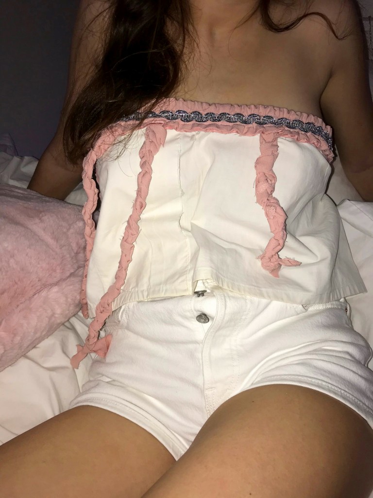
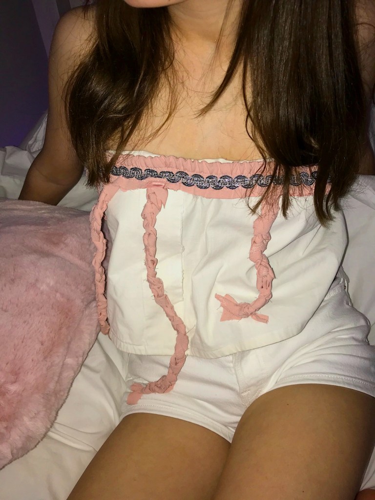
I am quite pleased with how my final garment turned out. I made it purely by using two deconstructed materials; An old school shirt, which I cut in half and used the bottom half to wrap around the body forming a bandeau. An old pair of pink cotton trousers, which I cut up into strips to then plaited together to form a knot at the end. Also from the trousers I cut off the elastic waistband which i then wrapped around the top of the white shirt, and attached the plaited knots. To add decoration to my top I found an old silver ribbon at home which i folded round the waistband and tied a bow at the back, where I have attached a strip of velcro to bring the top together.

In terms of the location for my shoot, I wanted to use quite a simple, relaxed location, as even though I feel like this top could be dressed up and down, primarily it would be most commonly worn as part of everyday wear in the warmer seasons. When I think of the word relaxed I instantly think of my bed, so I decided to do my shoot there, also using a pink cushion as a prop which contrasts the pink in my garment.

Design a site like this with WordPress.com
Get started